
Projects
Hello! What you’re about to read is a list of projects I’ve contributed to — either alone, or with a team — in the fields of user experience and digital marketing.
I am, first and foremost, an academic. I was raised this way by friends and family, and thrown even deeper in as I fell in love with the fields I find myself chasing today in this section. I have followed the road of this field to its academic peak with graduate school; in every way I could put into words and actions, user experience is my love and passion. That is the package deal with me. I love this world: every aspect of user experience I have studied, lived, and breathed.
The projects here will go into detail about the context of how each assignment started, what the deliverables were, and what the process was to accomplish the deliverables for each project. This work is not presented as a collection of polished end results, but as evidence of my thinking, my growth, and my commitment to approaching problems with care, curiosity, and rigor. Each project reflects how I ask questions, navigate constraints, and translate research into design decisions grounded in both empathy and strategy.
More than anything, however, I hope the takeaway of these three projects is what you find in this introduction. I love the work I do, and I will love every second of the work I could do for you.

Project Portfolio
Annotate
What started my case study with Annotate?
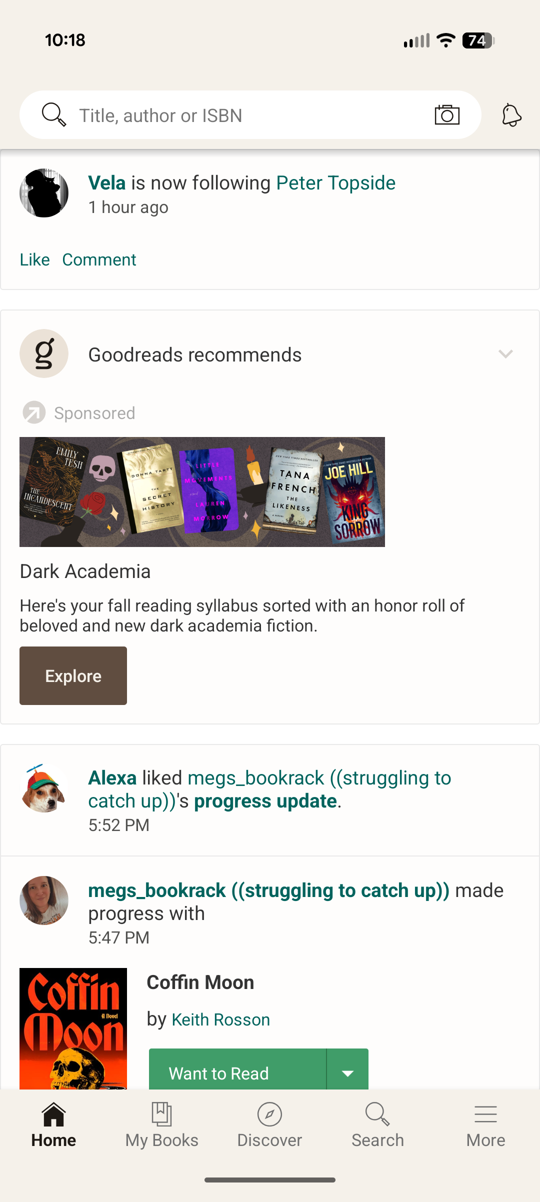
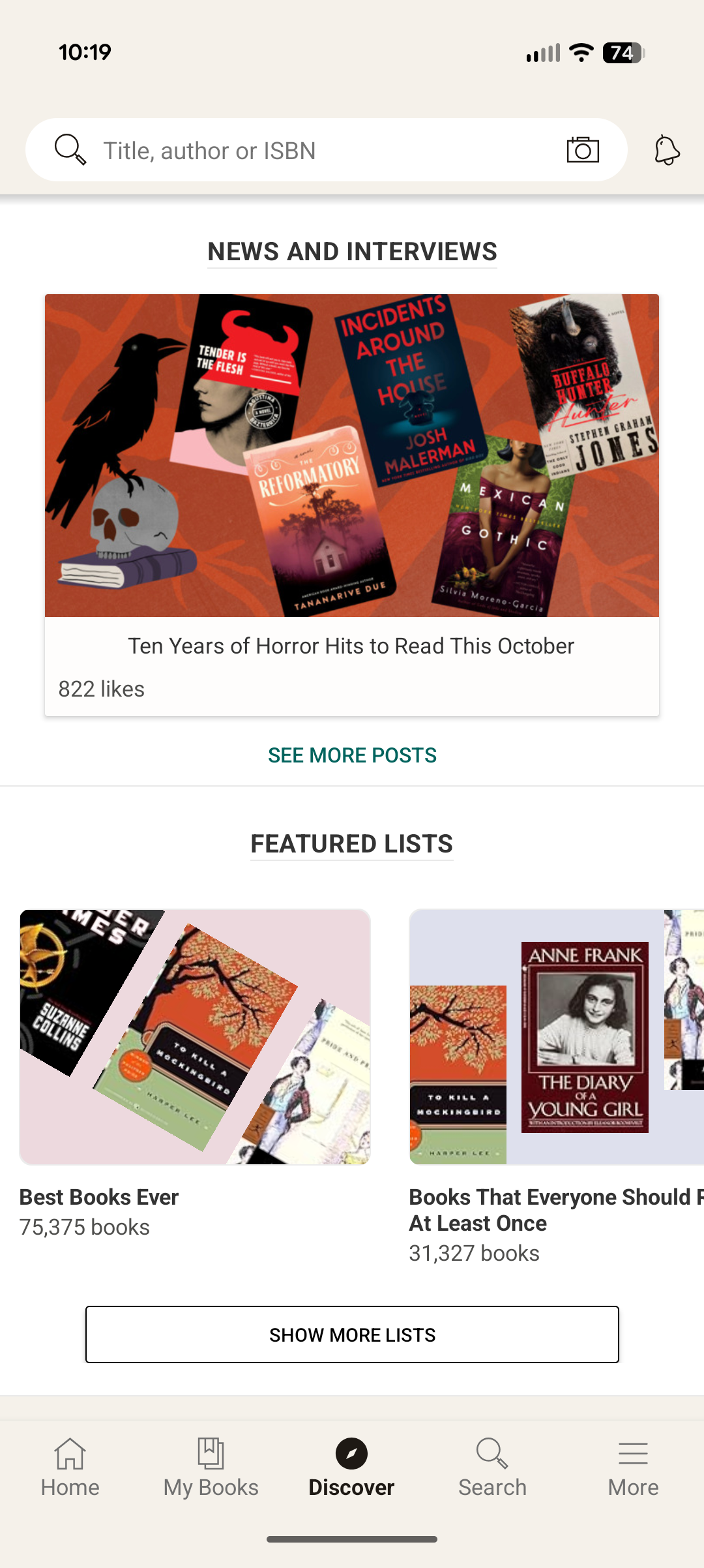
Annotate began as a passion project inspired by my love for reading and my ongoing search for the perfect reading tracker. Over time, I cycled through several popular platforms — Goodreads, StoryGraph, Fable, Pagebound, Oku.club, and Literal.club — each offering unique features but never quite capturing everything I wanted in a reading experience. Through exploring these apps, I noticed recurring gaps in usability, personalization, and community engagement. Annotate grew out of this reflection, combining what I learned from each platform into a single, cohesive mobile app concept designed to better support readers in tracking, reflecting on, and sharing their reading journeys.
Who was involved and what was made?
This project was made individually. All work presented for research, ideation, and design was completed on my own.
For this case study, I conducted a competitive analysis to examine the features, strengths, and weaknesses of mainstream reading tracker apps, gaining insight into how users currently engage with these platforms. Using these findings, I developed a general information architecture to define the structure and flow of the Annotate app, ensuring an intuitive user experience. From there, I designed high-fidelity wireframes that visualized the app’s interface and interactions, culminating in a fully realized final prototype that showcased the core functionality and visual design of Annotate.
Research // Competitive Analysis
To better understand the current landscape of reading tracker apps, I conducted a competitive analysis focusing on three of the most prominent platforms: Goodreads, StoryGraph, and Fable.
Goodreads stands out for its flexibility and scale—it provides nearly every tool a reader could need, from tracking and reviews to recommendations and community lists. Its massive user base also supports a dynamic browsing and discovery experience. However, the platform struggles with interface consistency and often feels visually crowded, which can hinder overall usability.
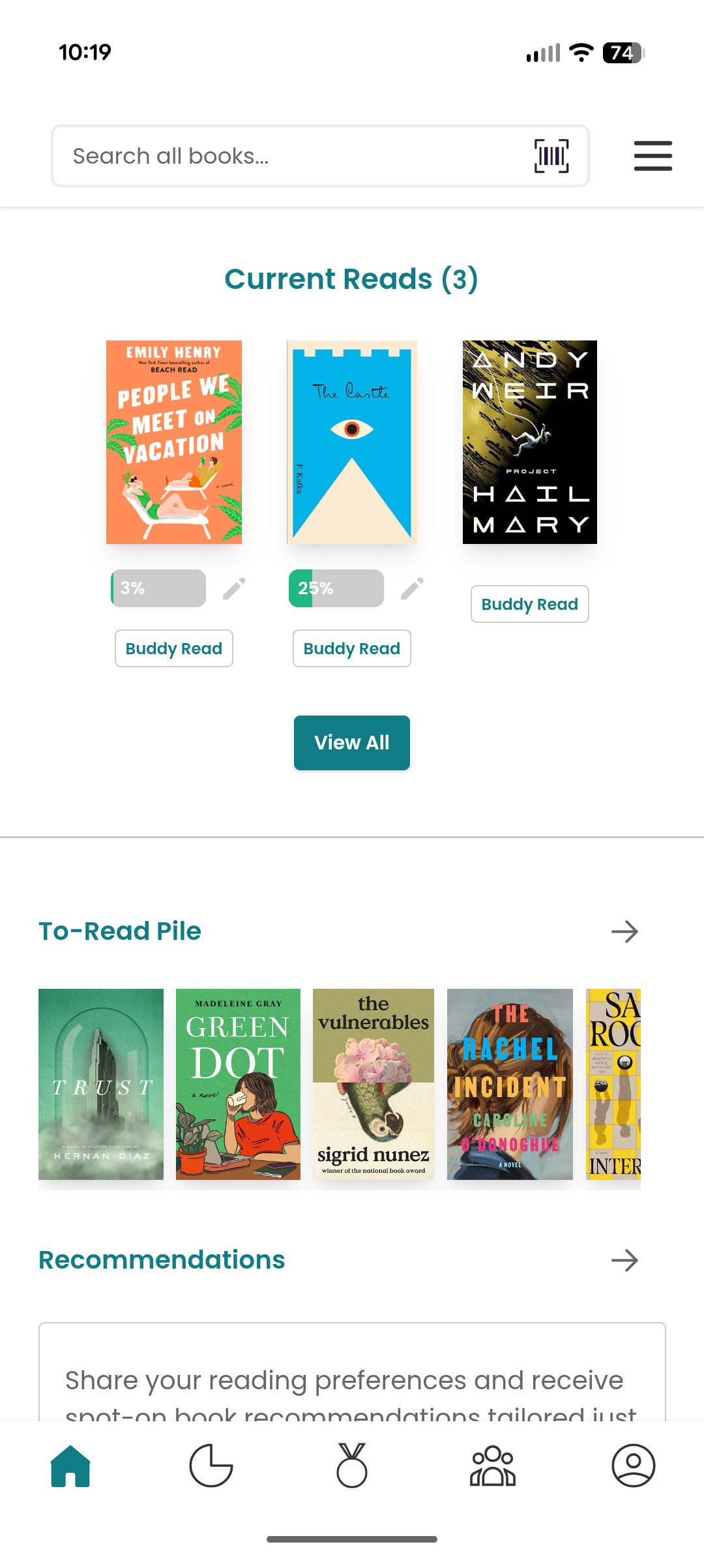
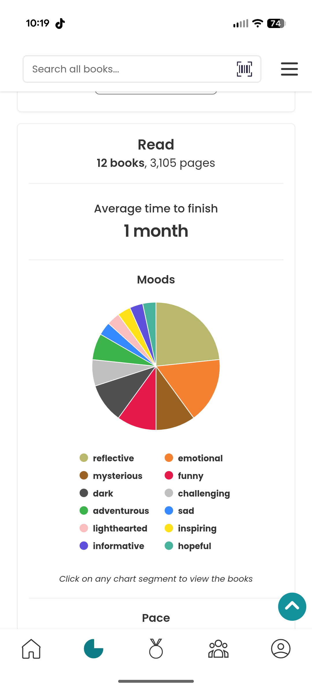
StoryGraph, by contrast, excels in personal tracking, offering robust functionality for analyzing reading habits and statistics over time. This analytical strength sets it apart from its competitors, though it lacks the same level of community engagement or social posting features.
Fable, on the other hand, shines in its cohesive interface design and strong promotion of community through book clubs, discussions, and social sharing. Fable became a major reference point in my own design process, especially in shaping Annotate’s information architecture, as I aimed to make posting, sharing, and engaging with fellow readers a core experience of the app.
Through this analysis, I gained a clearer understanding of what readers value most in a tracking app—balance between functionality, clarity, and connection. Goodreads highlighted the importance of scale and discoverability, but also reminded me of the pitfalls of cluttered design. StoryGraph demonstrated the appeal of meaningful data visualization and personal insights, while Fable reinforced the impact of a clean interface and strong community features. Combining these observations, I identified a core opportunity for Annotate: to create a platform that merges StoryGraph’s depth of tracking with Fable’s sense of community, all within a more focused and visually consistent interface.
Goodreads
Storygraph
Fable
Ideation // Information Architecture
Building on the insights from my competitive analysis, I designed Annotate’s information architecture to create a clear, engaging, and intuitive experience for readers. My primary goal was to highlight community interaction as the central feature of the app while keeping personal tracking accessible and easy to navigate. I organized the structure around three main pillars—Track, Share, and Discover—to reflect the core user actions and maintain a logical flow throughout the experience.
While browsing and adding books remain a key part of the app, they were intentionally positioned as a secondary focus to engagement. Certain navigation elements help users seamlessly add books to folders or collections, but the IA ultimately places community-driven activity—such as posting, commenting, and sharing—at the forefront, similar to platforms like Twitter or Threads. This approach ensured that Annotate’s foundation emphasized connection and participation, supporting its goal of making reading a more social and interactive experience.
Ideation // Initial Wireframes
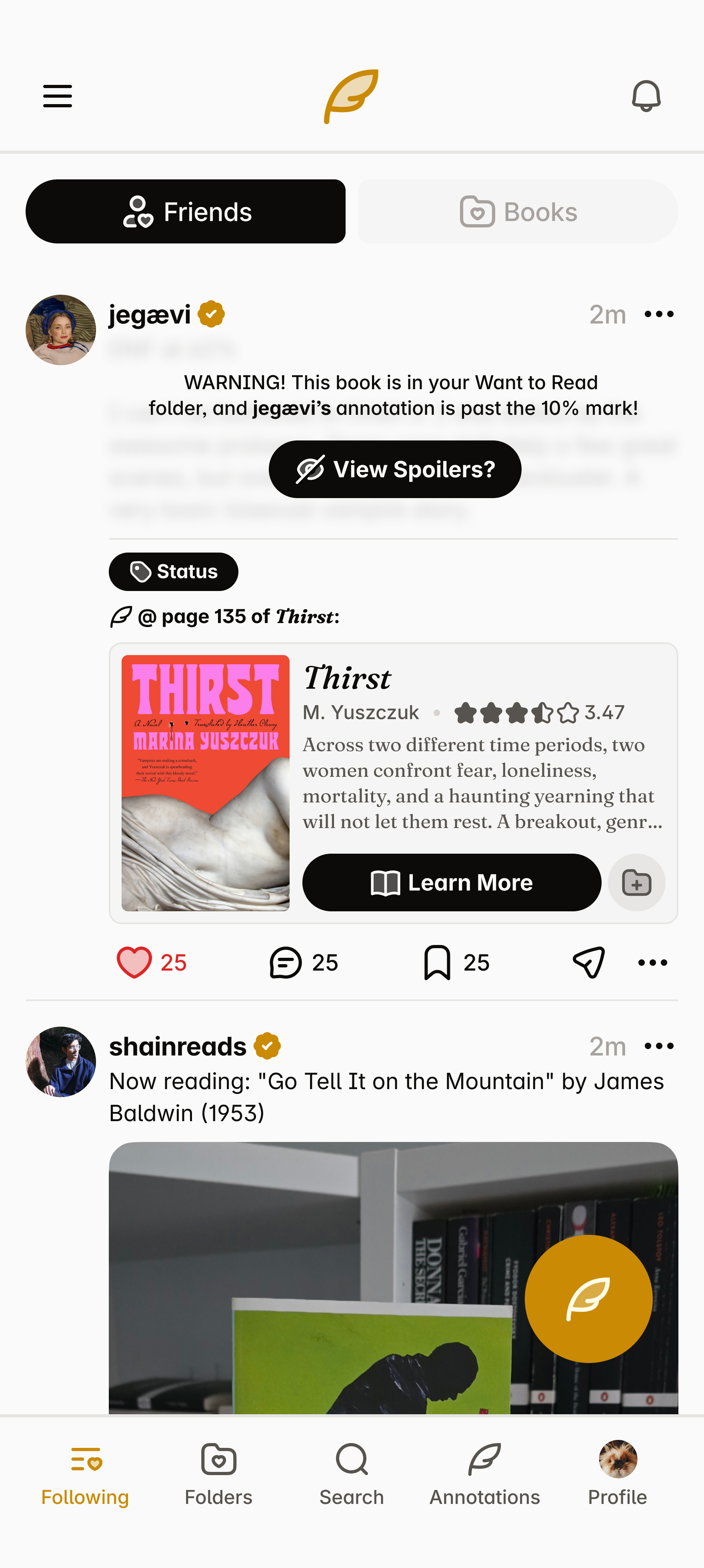
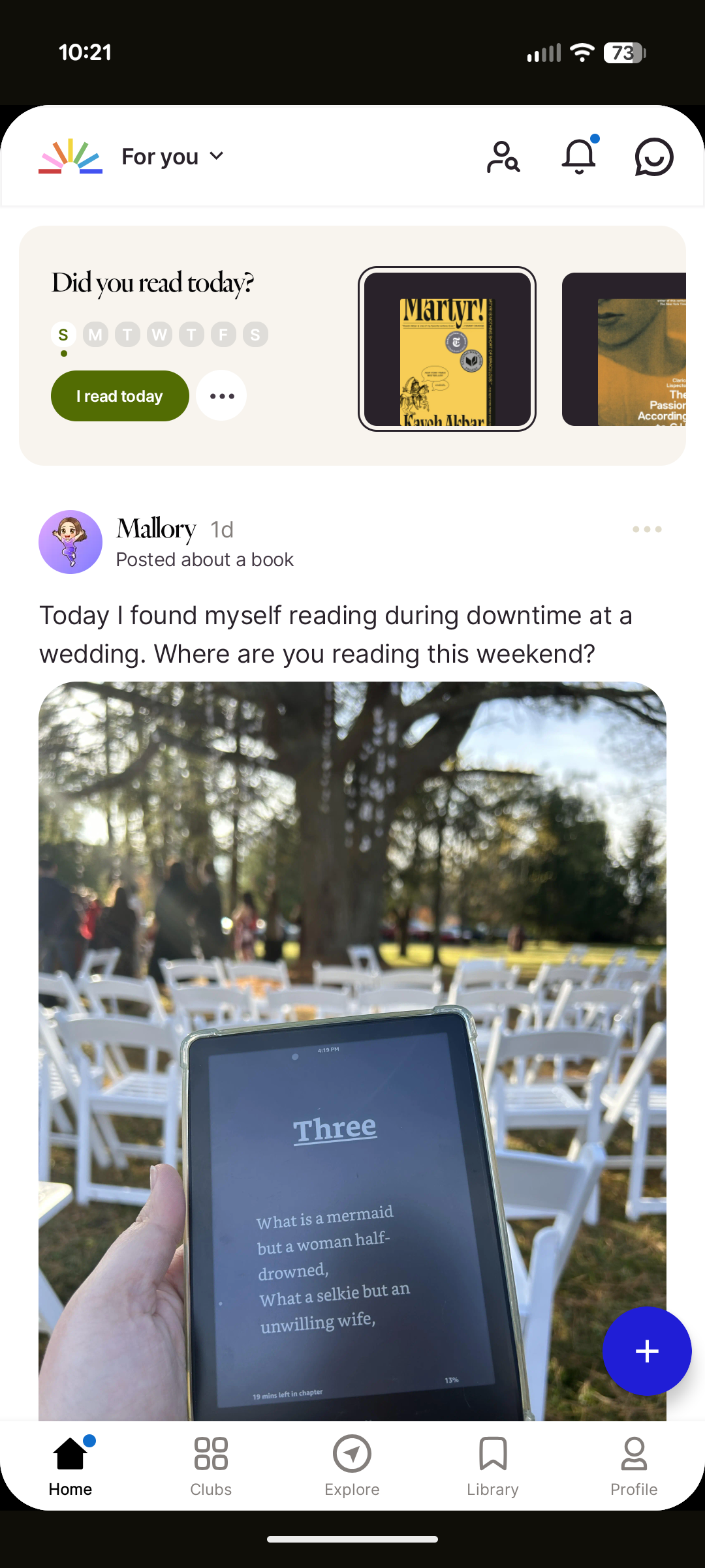
The wireframing process for Annotate began with a simple but foundational sketch drawn on an index card. This first physical wireframe helped me visualize the app’s overall layout, hierarchy, and user priorities before moving into digital design. The sketch depicted a home page centered around user posts—an early expression of Annotate’s focus on engagement and community interaction. At the top, two tabs labeled Friends and Books offered flexible ways for users to filter their feed, allowing them to view posts from people they follow or from books they’re tracking in their folders. This small but intentional design choice reflected my goal of blending social and reading experiences, giving users a personalized feed shaped by both their community and their collection.
As I moved into the high-fidelity prototype stage, my primary goal was to create a seamless and convenient experience between tracking books and engaging socially within the app. I wanted users to feel that managing their reading activity and participating in community discussions were naturally connected—not separate tasks. This meant focusing on smooth navigation, intuitive gestures, and consistent interface patterns that made switching between viewing a book, adding it to a folder, posting a reflection, or commenting on another user’s post effortless. By emphasizing this fluidity, the design aimed to reinforce Annotate’s core identity as both a reading tracker and a social space for readers to share, discover, and connect.
Final Prototype & Conclusions
The final prototype for Annotate brought together all the design goals and insights developed throughout the project. Built in Figma, the prototype includes a comprehensive set of pages and subpages that showcase the app’s full functionality. The Feed page centers on community engagement, allowing users to view and interact with posts from friends or books they follow. The Folders section provides an organized space for tracking reading progress—whether it’s books currently being read, finished, or saved for later. A dedicated Search page enables users to browse and discover new titles, while the Annotations page compiles all user posts and allows filtering by type, such as quotes, questions, discussions, theories, or updates. Rounding out the experience, the Profile page serves as a personal hub for tracking activity and sharing reflections.
In completing Annotate, I focused on integrating the strongest elements from existing reading tracker apps while reimagining how readers connect with one another. From Goodreads, I drew inspiration from its flexibility and vast network of content; from StoryGraph, I carried forward its robust personal tracking and data-driven insights; and from Fable, I adopted its cohesive interface and strong sense of community. However, Annotate pushes this concept further by placing community engagement at the core of the experience rather than treating it as an added feature. Through thoughtful information architecture, intentional navigation, and a design system built around interaction, Annotate presents a new take on reading apps—one that not only tracks what you read, but celebrates the conversations, reflections, and shared experiences that come with it.
Classes to Careers
What started my case study with Classes to Careers?
The goal of this semester-long project was to identify a problem or topic we wanted to investigate further regarding the transition from “class to career” for User Experience students at Arizona State University. Alongside Maica Avila, Katelyn Dang, Poorva Ketkar, Erin Mishark, and Atharva Nikam, we decided to narrow in on the job application process, in hope of identifying key problems in the experience that we can improve in the later half of the semester. After the research is completed as a team, we break apart to create individual solutions for the problems we identified in our two research methodologies.
Despite only one section being completed in full as a team with five other classmates, the entirety of this class was a collaborative effort. A significant percentage of this class—and, adjacently, this project—was spent working on my individually completed tasks alongside my classmates: seeing their process, letting them see my process, and bouncing ideas off one another constantly. I worked with some incredibly talented students during this project, and—with how widespread our assignments were, moving from one section to the next—one major skill I learned was identifying strengths of each classmate.
Who was involved and what was made?
The research phase included 5 teammates from the College of Integrative Sciences and Arts: Maica Avila, Katelyn Dang, Poorva Ketkar, Erin Mishark, and Atharva Nikam.
The Initial Research phase was the only section completed entirely as a group, involving a competitive analysis, a research plan, and two research methodologies: user interviews and think-aloud inquiries. In the Research Findings phase, we collaborated on a comprehensive report, while individual deliverables—such as the proto-persona and user stories—were completed independently. The Ideation phase included an in-class workshop and scenario sketches based on key insights, leading into the Design phase, where these ideas were developed into a cohesive high-fidelity prototype in Figma.
Research // Research Findings
Our team conducted a qualitative study using user interviews and think-aloud inquiries to understand the experiences of ASU students and recent graduates navigating the job search process. By observing participants interact with job platforms and describe their decision-making in real time, we uncovered key challenges in content creation (writing cover letters and tailoring resumes), portfolio development, and job filtering (finding opportunities that align with skills, goals, and sponsorship needs). Participants also emphasized the importance of company culture, mentorship, and accessible guidance throughout their search. These findings revealed a gap in how students manage and reflect on their job applications, inspiring our next phase of ideation to focus on solutions that simplify tracking, enhance confidence, and better connect students with relevant opportunities and support.
Research & Ideation // Proto-Persona and User Stories
Based on insights gathered during the research phase, I developed a proto-persona named Eleanor, a 23-year-old master’s student at ASU preparing to transition from academia into the UX field. Eleanor represents motivated graduate students who are confident in their abilities but often feel overwhelmed by the complexity of the job application process. Her goals include refining resumes and cover letters for multiple job types, building a strong professional portfolio, and receiving feedback from mentors or peers. Her frustrations—such as organizing document variations, tracking application progress, and finding suitable opportunities—helped shape the core features of the project and grounded the design process in real user challenges.
From Eleanor’s needs and motivations, I developed a series of user stories to guide the design direction and ensure each feature supported user goals. These stories captured specific tasks and desired outcomes, such as: “As a student, I want to easily organize and reuse application materials so I can save time when applying for multiple roles,” and “As a job seeker, I want to track my application history so I can reflect on my progress and identify areas for improvement.” The user stories played a key role in shaping the direction of my ideation process by clarifying what users like Eleanor truly needed from a solution. Each story highlighted recurring themes of organization, visibility, and control—users wanted a way to manage their application materials and track their progress in one unified place. These insights guided me toward the concept of a digital dashboard designed to help users keep track of their job applications alongside the content they create for them, such as resumes, cover letters, and project experience. The goal was to give users the tools necessary to organize and adapt their materials for different roles or fields, reducing the cognitive load and confusion often tied to juggling multiple versions of application documents. This focus became the foundation for the next phase of design, where the structure and functionality of the dashboard began to take form.
Ideation & Design // Initial Wireframes
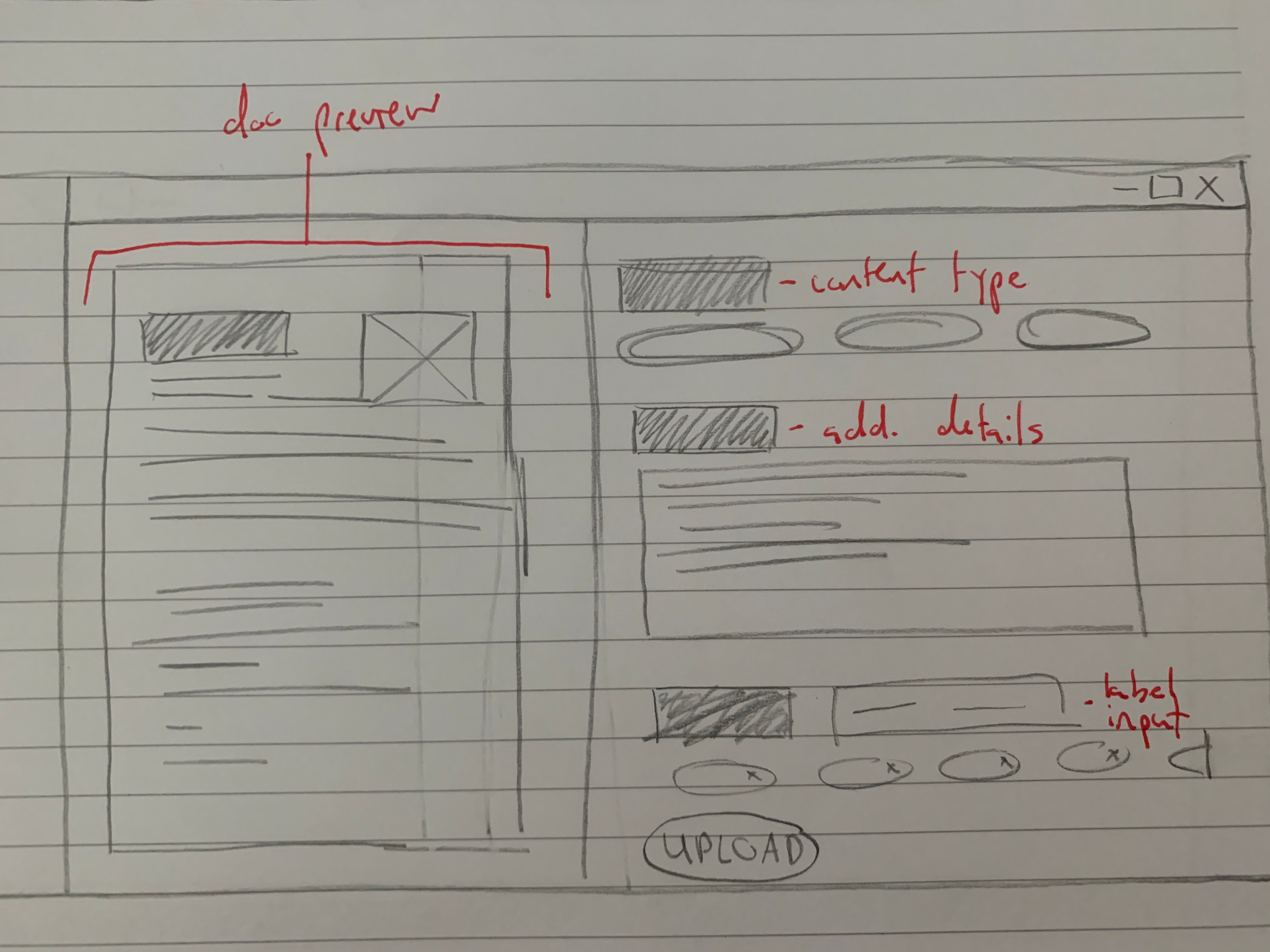
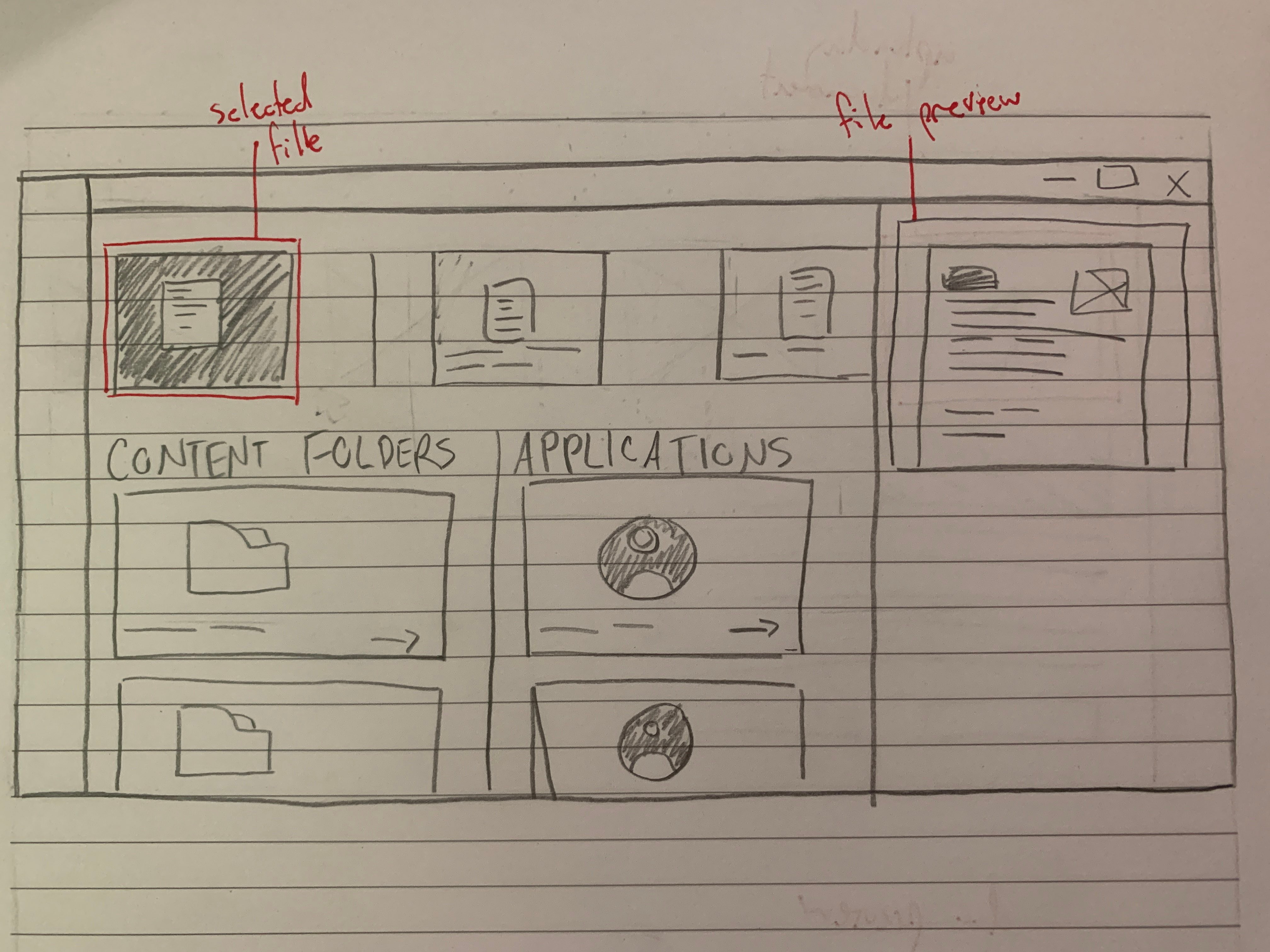
Building on the direction established through my user stories and ideation exercises, I began the design process by sketching initial wireframes on paper to visualize the core layout and functionality of the platform. These early sketches outlined a job application tracking dashboard centered around organization and clarity. The concept focused on allowing users to upload the content they use for applications—such as resumes, cover letters, and project examples—while keeping notes on where each piece had been used. I also incorporated a system of labels and tags to help users categorize their materials by relevance to specific positions, fields, or skill sets. This paper stage helped me quickly explore different structures and interactions, establishing a foundation for how users would manage and navigate their application materials within a single cohesive dashboard.
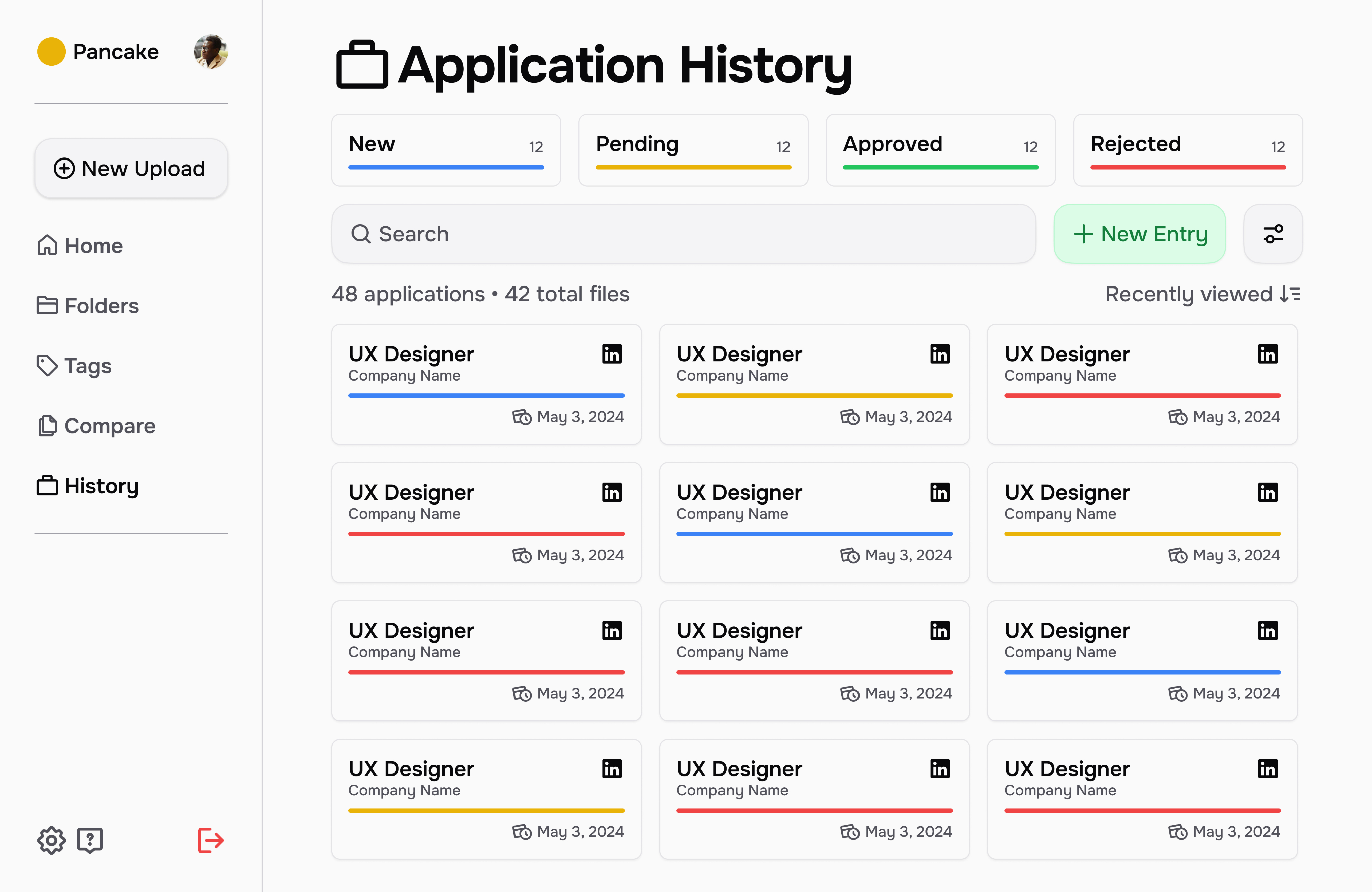
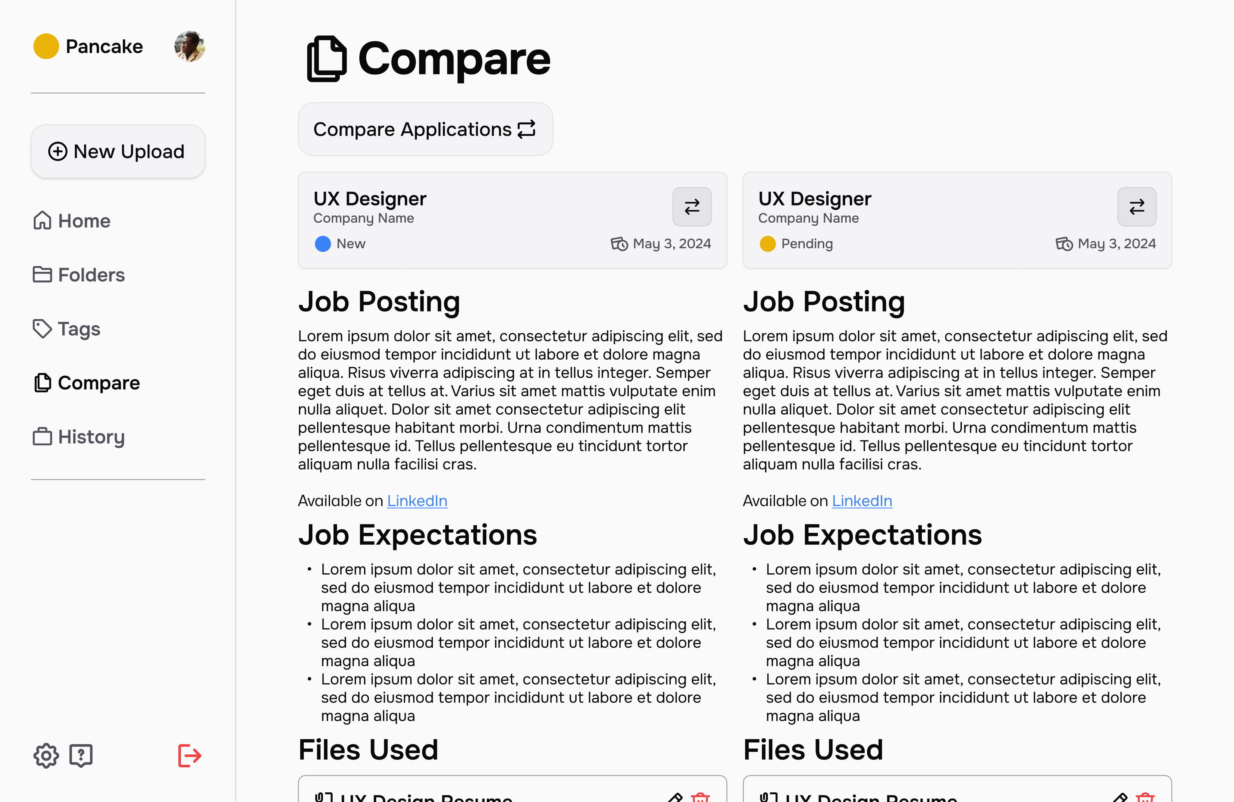
Final Prototype
In the final stage of the project, I translated my paper concepts into high-fidelity prototypes for my product, which I named Pancake—a reference to the “stack” of content users build throughout their job application journey. The name reflects the layered, iterative nature of the process, where each resume, cover letter, and project contributes to a growing foundation of professional experience. The final prototype brought together all previous insights, emphasizing organization, clarity, and ease of use in managing application materials. I concluded the project by presenting my findings and design outcomes alongside my teammates, Maica and Katelyn, demonstrating how our collective research and individual design directions addressed the challenges uncovered during our user studies. Together, our work showcased a comprehensive approach to understanding and improving the student-to-career transition through thoughtful, user-centered design.
Conclusions
The significance of this project stands true most in my growth as a collaborative worker, listener, and leader, but also through the sheer scale of Classes to Careers. Looking back on the semester as a whole, the project had integration of the UX design process, analysis and reporting on user research (including supporting documents based on data), initial sketches, and final high-fidelity interfaces. This project provided insight on every stage of the design cycle, and allowed us as students to better understand the needs of this cycle as a whole.
Throughout this project, I played a key role in writing, content organization, and ideation, particularly during the collaborative stages focused on the research plan and findings report. Much of my team involvement centered on strategic planning and coordination, ensuring clear task ownership and realistic timelines. As the project transitioned into individual work, I naturally took on both mentorship and collaboration roles—offering feedback and design suggestions to peers while also seeking their input to refine my own ideas. This ongoing exchange of insights strengthened not only the final outcomes but also my ability to communicate effectively, provide constructive critique, and adapt within a multidisciplinary team environment. Working alongside such talented peers was an invaluable experience that deepened my collaborative and leadership skills.
Poetential
What started my case study with Poetential?
For this case study, I collaborated with Cardell Poe, the founder of Poetential, a local Twin Cities business focused on providing healthy alternatives to traditional snacks, such as muffins. After an initial conversation with Cardell to understand his goals and the challenges his business faced, I began a structured research process to uncover insights about his target audience, product positioning, and potential digital presence. Using a combination of qualitative research methodologies, I gathered information on user behaviors, preferences, and perceptions related to healthy snacking and small food businesses. These findings guided the design phase, where I translated insights into strategic design decisions aimed at strengthening Poetential’s brand identity and creating a more engaging experience for its customers.
Who was involved and what was made?
This project was made individually. All work presented for research, ideation, and design was completed on my own.
The Poetential project progressed through several key phases, each building on the last. The initial research phase included a survey with over 25 respondents, a detailed research plan, and user interviews—all emphasizing accessibility to ensure inclusivity from the start. I also conducted an accessibility audit of Poetential’s existing website, assessing visual contrast, navigation, and compliance with accessibility standards. In the usability testing phase, I developed materials, conducted tests, and compiled findings addressing both usability and accessibility. These insights informed wireframing, where I created low-fidelity designs focused on clarity and inclusive interaction. The project concluded with high-fidelity prototypes in Figma, integrating user feedback and maintaining accessibility best practices throughout.
Research // Quantitative Survey & User Personas
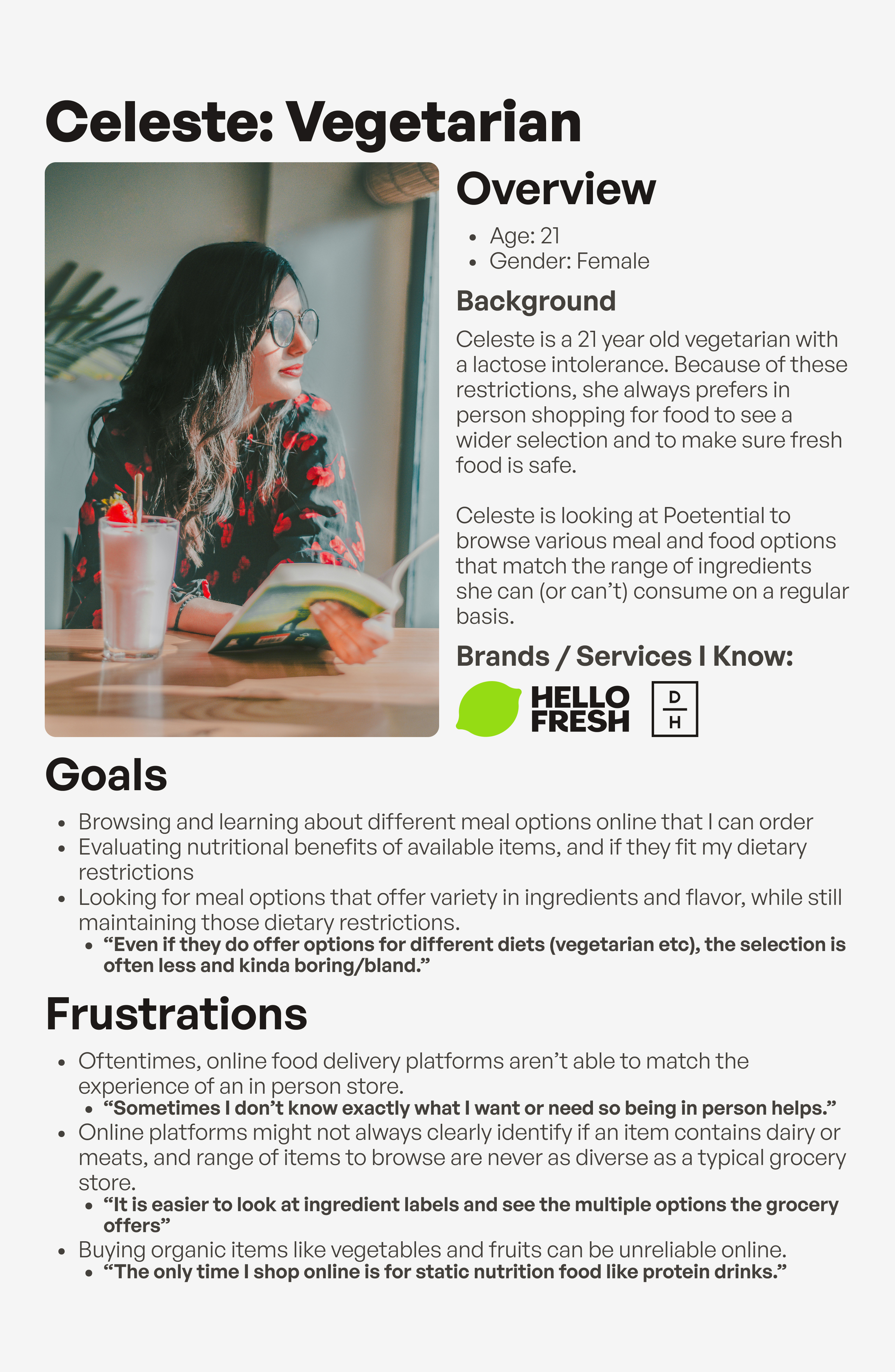
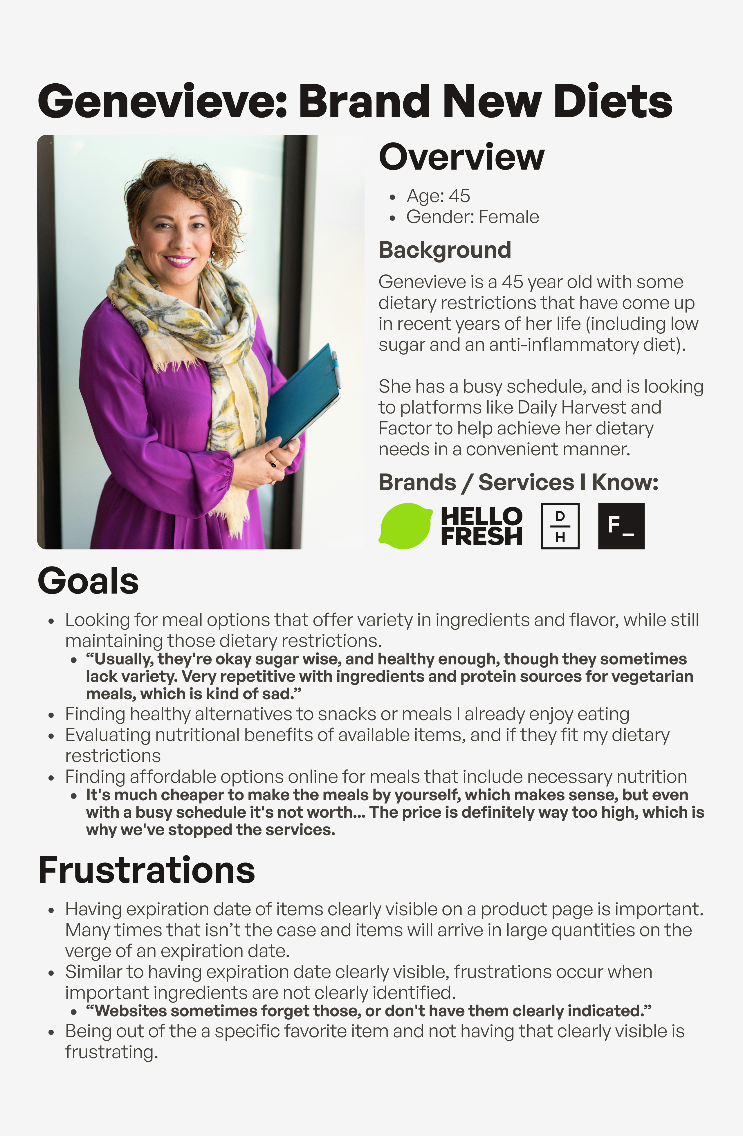
Poetential is an online service providing healthy alternatives to common food items. This is a service with various competitors having similar goals for their users, which led to a lot of questions for me to ask regarding interests and issues with Poetential or anything similar. This survey aimed to find primary demographic details for Poetential’s audience, and learn about some of the challenges and opportunities in Poetential’s user journey along with similar websites of other brands. The survey was sent to colleagues who expressed an interest in Poetential or websites with similar goals, and also spread out by the owner of Poetential himself which is where a significant percentage of participants came from. The survey ended with 28 total participants, with 17 participants being familiar with Poetential prior to taking the form. You can find the results for the survey in a full research document here.
The results were also brought to life with 3 different user personas, each visualizing different groups of demographics and response types found within the user survey.
Research // Accessibility Audit & Heuristic Evaluation
Poetential's current state has many opportunities for improvement in terms of accessibility. This accessibility audit was conducted using the Web Accesssibility Evaluation Tool, which helped in identifying key errors, alerts, and contrast issues within each page of Poetential. Categories, details, and severity levels for each section of the POUR acronym (Perceivable, Operable, Understandable, and Robust) were found using WebAIM's WCAG 2 Checklist. Various issues were found throughout all of Poetential's list of pages established in my heuristic evaluation, with the most common category in the POUR acronym being Perceivable. View the full accessibility audit here.
Research // Usability Testing
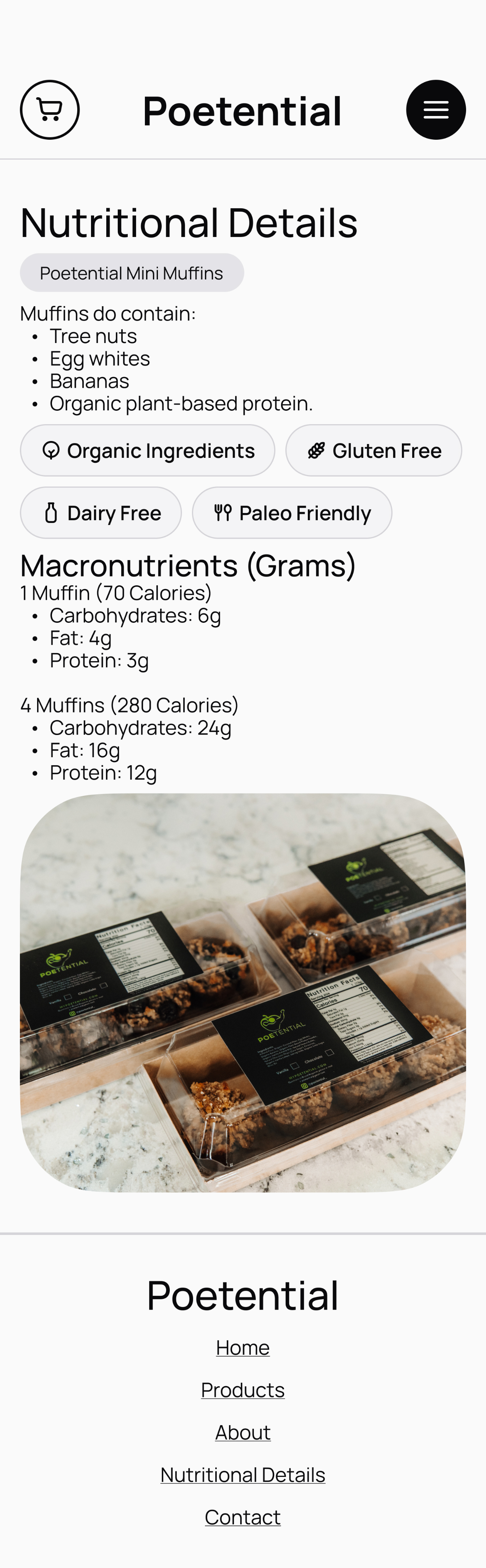
Many of Poetential’s current usability issues centered around the visibility and clarity of key product information, including stock status, nutritional details, storage and preparation guidelines, flavor profiles, and dietary classifications. Usability testing confirmed that users struggled to easily locate or interpret this information, which often disrupted the browsing and decision-making process. Participants also reported confusion with site navigation and difficulty reading certain text due to low contrast, highlighting broader accessibility concerns. Based on these findings, I proposed a series of targeted design solutions—such as improving contrast and readability on product and home pages, clearly labeling stock status and nutritional information, and adding storage and preparation details directly within product descriptions. Additional recommendations included visually organizing key ingredients, identifying dietary relevance, and reducing the dominance of green in the color palette to improve visual balance. Together, these refinements aimed to make Poetential’s website more intuitive, informative, and accessible, directly addressing the user pain points uncovered through testing.
View the usability testing materials here, and the usability testing data here.
Design // Initial Wireframes
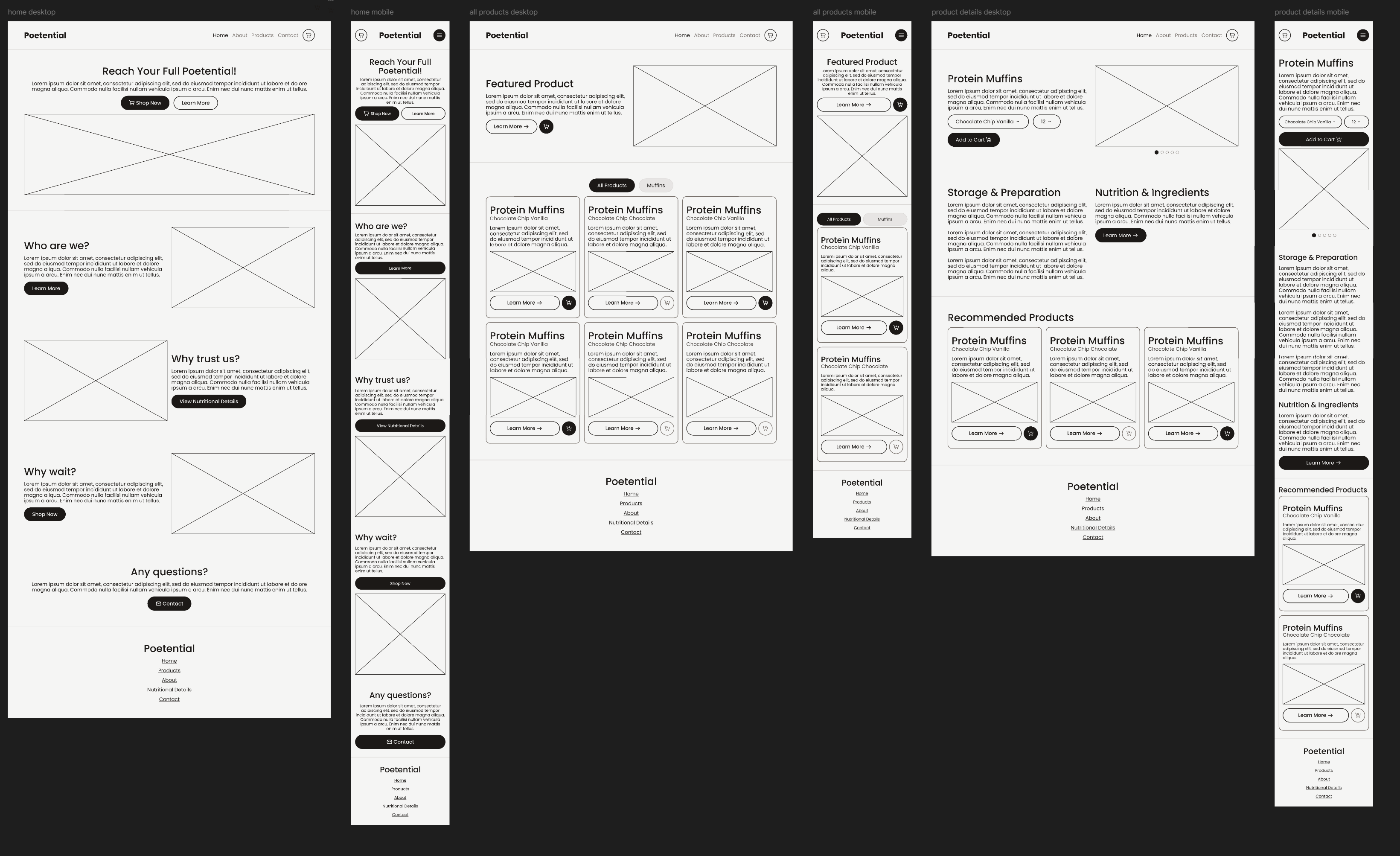
During the initial wireframing stage for Poetential, I began translating the insights gathered from both the usability tests and the heuristic evaluation into tangible design solutions. These low-fidelity wireframes focused on restructuring product pages to improve information hierarchy and ensure that key details—such as stock status, nutritional information, and storage or preparation instructions—were immediately visible and easy to interpret. I also experimented with clearer navigation patterns, stronger visual contrast, and simplified layouts to address accessibility concerns identified in earlier testing. This stage served as the foundation for refining the site’s usability and setting the groundwork for the high-fidelity prototype.
Design // Final Prototype
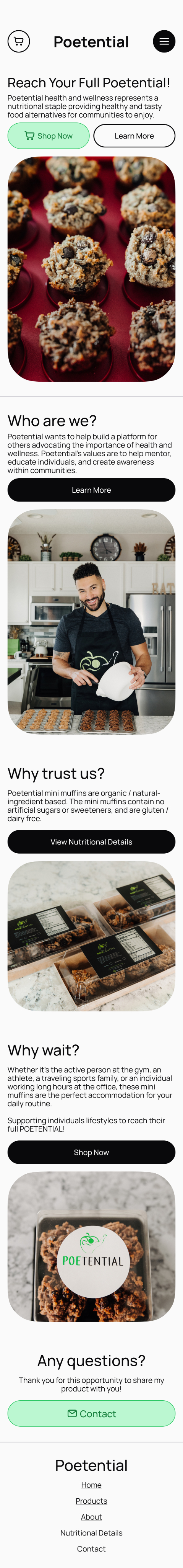
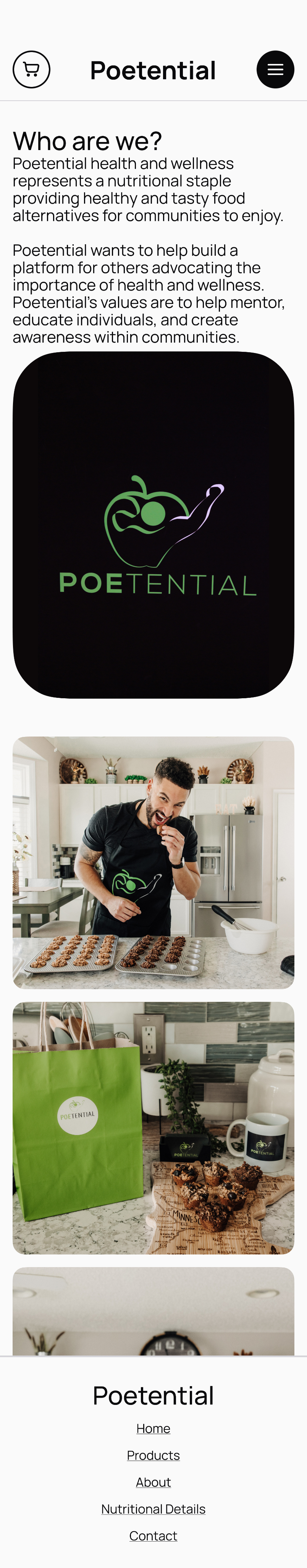
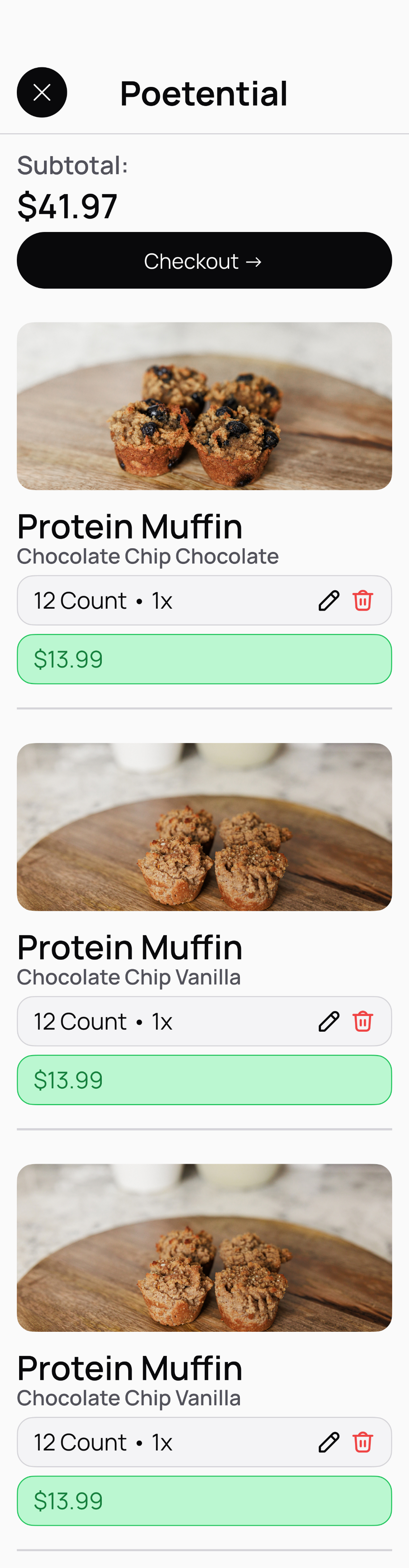
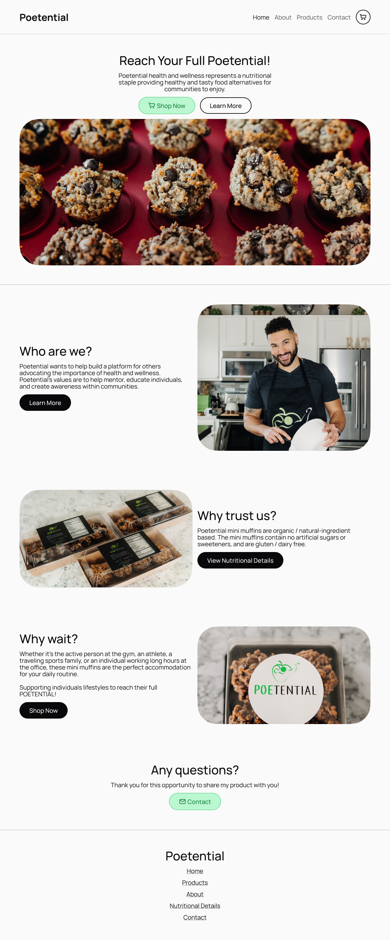
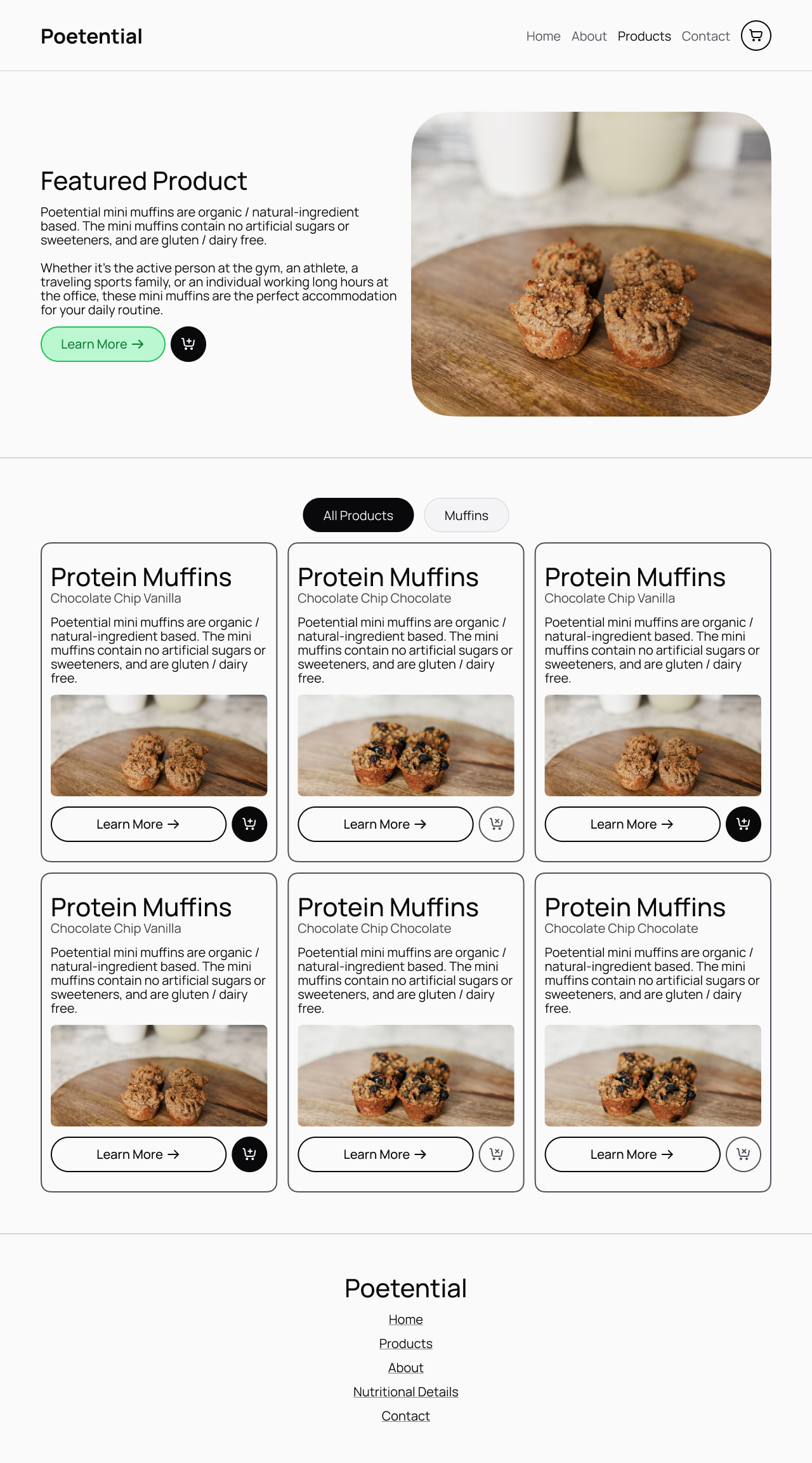
For the desktop and mobile redesign prototypes of Poetential, I focused on resolving key usability issues identified during testing, including navigation confusion, missing ingredient details, poor contrast, lack of storage and preparation information, and unclear stock indicators. Usability testing showed that 40% of participants experienced confusion with navigation, 4 out of 5 wanted more ingredient details, all participants struggled to find storage or preparation guidance, and 3 out of 5 had trouble determining product availability. In response, the redesigned prototypes introduced a simplified navigation bar with all main pages visible, removing the collapsible sidebar for easier access. Ingredient and nutritional details were made more discoverable through added buttons on both the home and product pages. Contrast and readability were enhanced across the interface, particularly on the “All Products” page tabs, to clearly show which section is active. Storage and preparation information now appears directly below key product actions, and stock status is communicated through distinct, high- and low-contrast “add to cart” buttons. Together, these updates create a clearer, more accessible, and user-friendly browsing experience.
Conclusions
The Poetential project stands out as the most research-dense case study in my portfolio, representing a full cycle of user-centered design grounded in continuous analysis and iteration. From surveys, interviews, and accessibility audits to usability testing and heuristic evaluations, each stage of research provided new insights that shaped and refined the redesign process. Every phase offered an opportunity to reflect on findings, reassess assumptions, and identify actionable solutions that directly improved the user experience. The result was a thoughtful, accessibility-focused redesign supported by evidence from real users, demonstrating my ability to move between research and design.
Projects
Hello! What you’re about to read is a list of projects I’ve contributed to — either alone, or with a team — in the fields of user experience and digital marketing.
I am, first and foremost, an academic. I was raised this way by friends and family, and thrown even deeper in as I fell in love with the fields I find myself chasing today in this section. I have followed the road of this field to its academic peak with graduate school; in every way I could put into words and actions, user experience is my love and passion. That is the package deal with me. I love this world: every aspect of user experience I have studied, lived, and breathed.
The projects here will go into detail about the context of how each assignment started, what the deliverables were, and what the process was to accomplish the deliverables for each project. This work is not presented as a collection of polished end results, but as evidence of my thinking, my growth, and my commitment to approaching problems with care, curiosity, and rigor. Each project reflects how I ask questions, navigate constraints, and translate research into design decisions grounded in both empathy and strategy.
More than anything, however, I hope the takeaway of these three projects is what you find in this introduction. I love the work I do, and I will love every second of the work I could do for you.
Project Portfolio
Annotate
What started my case study with Annotate?
Annotate began as a passion project inspired by my love for reading and my ongoing search for the perfect reading tracker. Over time, I cycled through several popular platforms — Goodreads, StoryGraph, Fable, Pagebound, Oku.club, and Literal.club — each offering unique features but never quite capturing everything I wanted in a reading experience. Through exploring these apps, I noticed recurring gaps in usability, personalization, and community engagement. Annotate grew out of this reflection, combining what I learned from each platform into a single, cohesive mobile app concept designed to better support readers in tracking, reflecting on, and sharing their reading journeys.
Who was involved and what was made?
This project was made individually. All work presented for research, ideation, and design was completed on my own.
For this case study, I conducted a competitive analysis to examine the features, strengths, and weaknesses of mainstream reading tracker apps, gaining insight into how users currently engage with these platforms. Using these findings, I developed a general information architecture to define the structure and flow of the Annotate app, ensuring an intuitive user experience. From there, I designed high-fidelity wireframes that visualized the app’s interface and interactions, culminating in a fully realized final prototype that showcased the core functionality and visual design of Annotate.
Research // Competitive Analysis
To better understand the current landscape of reading tracker apps, I conducted a competitive analysis focusing on three of the most prominent platforms: Goodreads, StoryGraph, and Fable.
Goodreads stands out for its flexibility and scale—it provides nearly every tool a reader could need, from tracking and reviews to recommendations and community lists. Its massive user base also supports a dynamic browsing and discovery experience. However, the platform struggles with interface consistency and often feels visually crowded, which can hinder overall usability.
StoryGraph, by contrast, excels in personal tracking, offering robust functionality for analyzing reading habits and statistics over time. This analytical strength sets it apart from its competitors, though it lacks the same level of community engagement or social posting features.
Fable, on the other hand, shines in its cohesive interface design and strong promotion of community through book clubs, discussions, and social sharing. Fable became a major reference point in my own design process, especially in shaping Annotate’s information architecture, as I aimed to make posting, sharing, and engaging with fellow readers a core experience of the app.
Through this analysis, I gained a clearer understanding of what readers value most in a tracking app—balance between functionality, clarity, and connection. Goodreads highlighted the importance of scale and discoverability, but also reminded me of the pitfalls of cluttered design. StoryGraph demonstrated the appeal of meaningful data visualization and personal insights, while Fable reinforced the impact of a clean interface and strong community features. Combining these observations, I identified a core opportunity for Annotate: to create a platform that merges StoryGraph’s depth of tracking with Fable’s sense of community, all within a more focused and visually consistent interface.
Goodreads
Storygraph
Fable
Ideation // Information Architecture
Building on the insights from my competitive analysis, I designed Annotate’s information architecture to create a clear, engaging, and intuitive experience for readers. My primary goal was to highlight community interaction as the central feature of the app while keeping personal tracking accessible and easy to navigate. I organized the structure around three main pillars—Track, Share, and Discover—to reflect the core user actions and maintain a logical flow throughout the experience.
While browsing and adding books remain a key part of the app, they were intentionally positioned as a secondary focus to engagement. Certain navigation elements help users seamlessly add books to folders or collections, but the IA ultimately places community-driven activity—such as posting, commenting, and sharing—at the forefront, similar to platforms like Twitter or Threads. This approach ensured that Annotate’s foundation emphasized connection and participation, supporting its goal of making reading a more social and interactive experience.
Ideation // Initial Wireframes
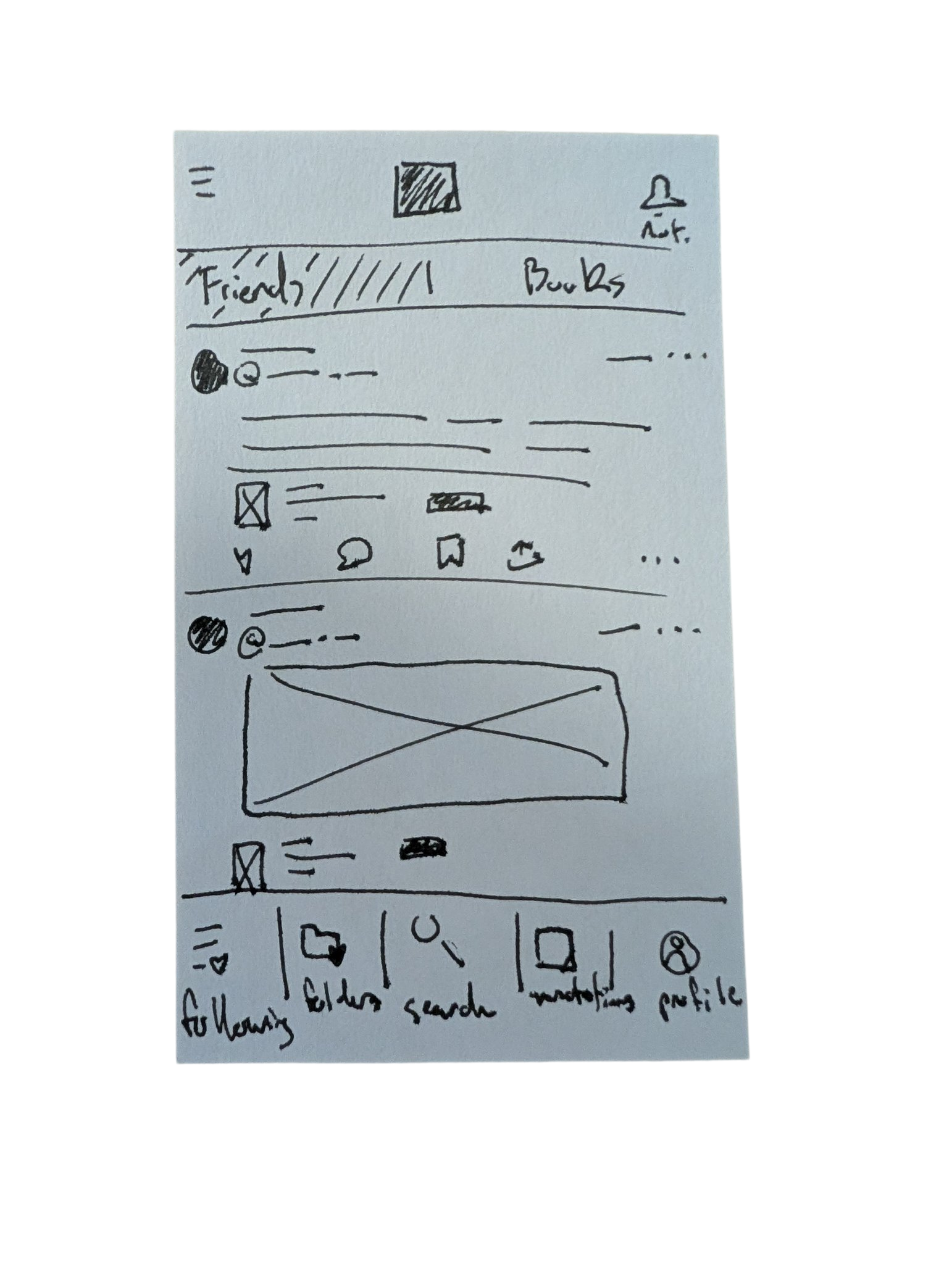
The wireframing process for Annotate began with a simple but foundational sketch drawn on an index card. This first physical wireframe helped me visualize the app’s overall layout, hierarchy, and user priorities before moving into digital design. The sketch depicted a home page centered around user posts—an early expression of Annotate’s focus on engagement and community interaction. At the top, two tabs labeled Friends and Books offered flexible ways for users to filter their feed, allowing them to view posts from people they follow or from books they’re tracking in their folders. This small but intentional design choice reflected my goal of blending social and reading experiences, giving users a personalized feed shaped by both their community and their collection.
As I moved into the high-fidelity prototype stage, my primary goal was to create a seamless and convenient experience between tracking books and engaging socially within the app. I wanted users to feel that managing their reading activity and participating in community discussions were naturally connected—not separate tasks. This meant focusing on smooth navigation, intuitive gestures, and consistent interface patterns that made switching between viewing a book, adding it to a folder, posting a reflection, or commenting on another user’s post effortless. By emphasizing this fluidity, the design aimed to reinforce Annotate’s core identity as both a reading tracker and a social space for readers to share, discover, and connect.
Final Prototype & Conclusions
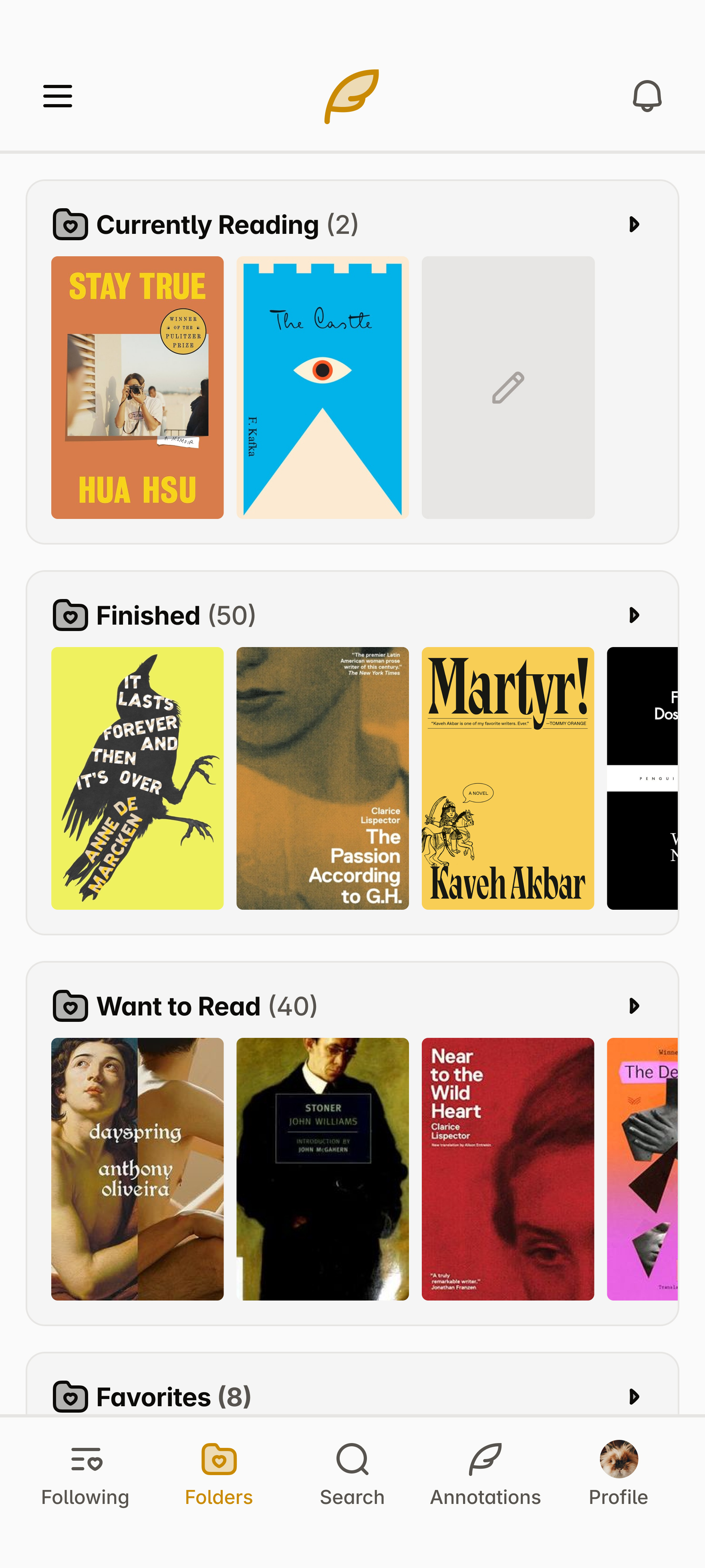
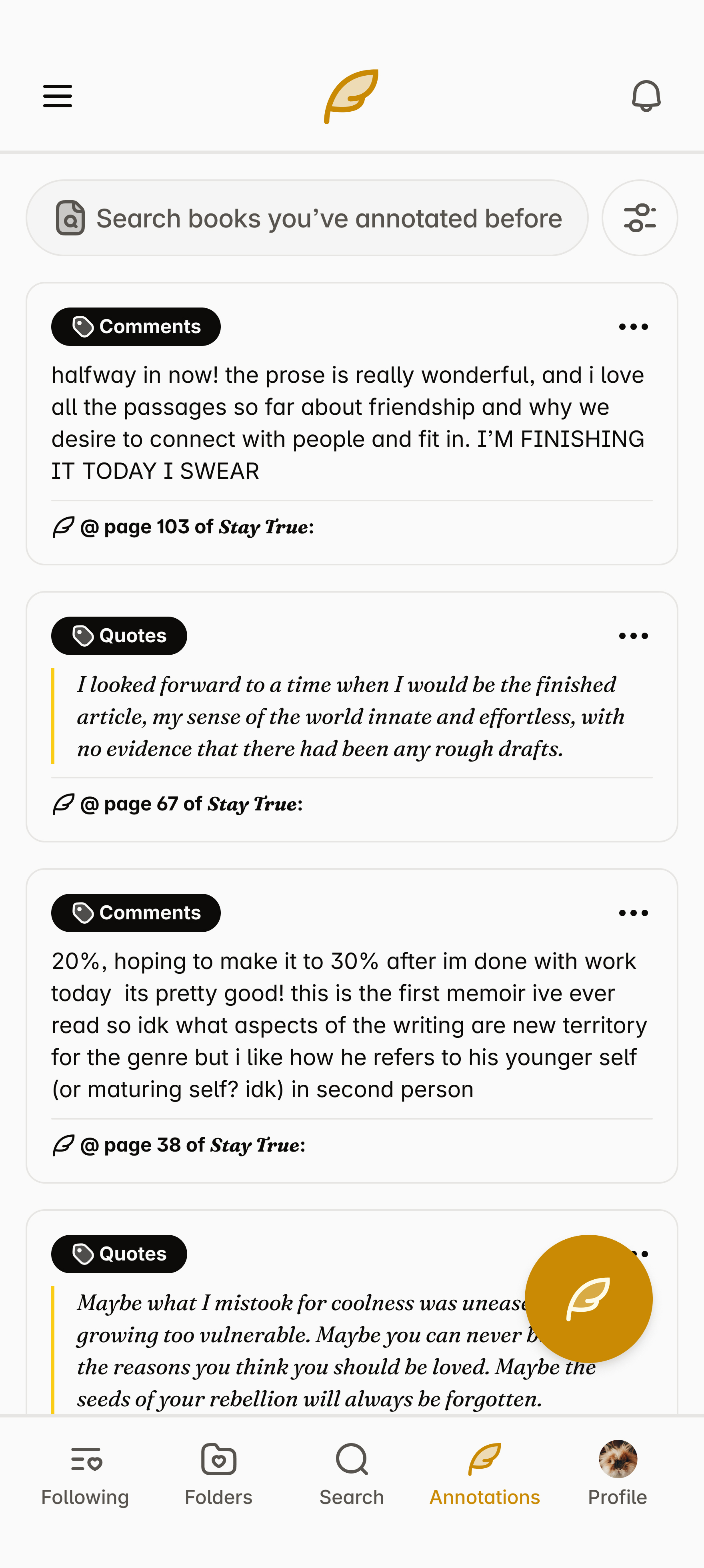
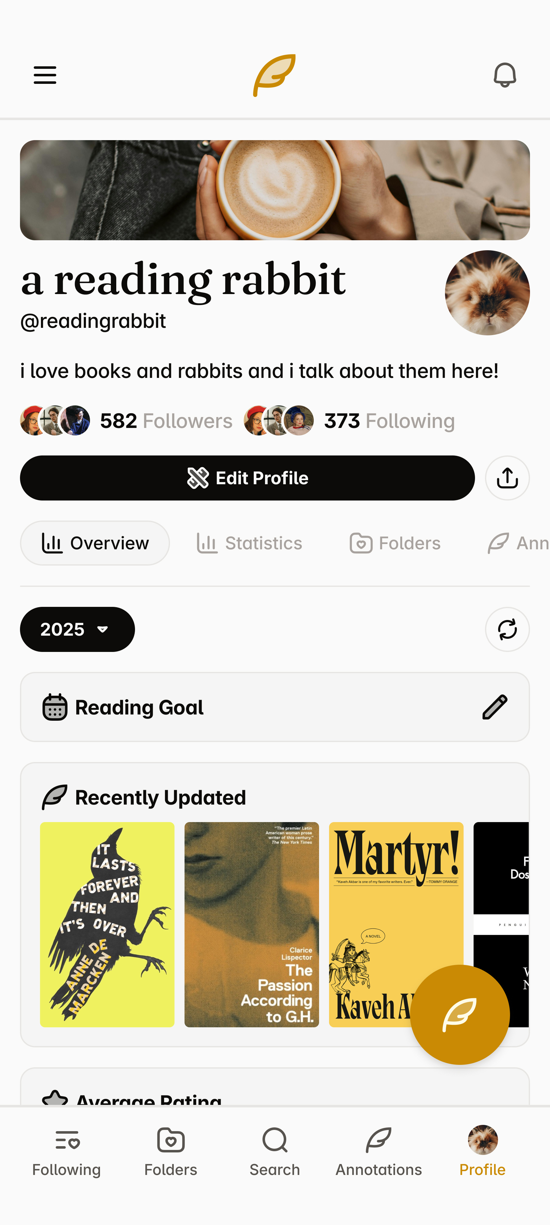
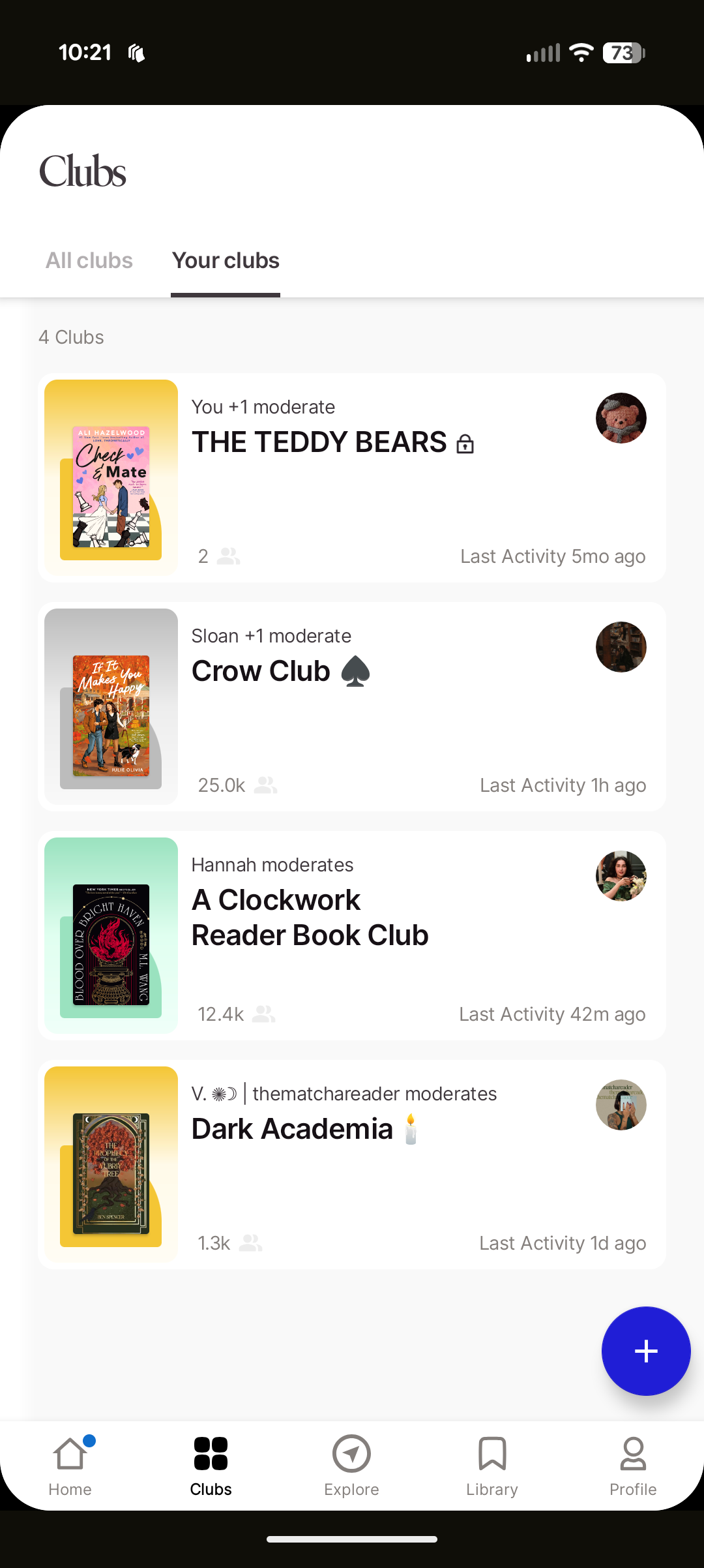
The final prototype for Annotate brought together all the design goals and insights developed throughout the project. Built in Figma, the prototype includes a comprehensive set of pages and subpages that showcase the app’s full functionality. The Feed page centers on community engagement, allowing users to view and interact with posts from friends or books they follow. The Folders section provides an organized space for tracking reading progress—whether it’s books currently being read, finished, or saved for later. A dedicated Search page enables users to browse and discover new titles, while the Annotations page compiles all user posts and allows filtering by type, such as quotes, questions, discussions, theories, or updates. Rounding out the experience, the Profile page serves as a personal hub for tracking activity and sharing reflections.
In completing Annotate, I focused on integrating the strongest elements from existing reading tracker apps while reimagining how readers connect with one another. From Goodreads, I drew inspiration from its flexibility and vast network of content; from StoryGraph, I carried forward its robust personal tracking and data-driven insights; and from Fable, I adopted its cohesive interface and strong sense of community. However, Annotate pushes this concept further by placing community engagement at the core of the experience rather than treating it as an added feature. Through thoughtful information architecture, intentional navigation, and a design system built around interaction, Annotate presents a new take on reading apps—one that not only tracks what you read, but celebrates the conversations, reflections, and shared experiences that come with it.
Classes to Careers
What started my case study with Classes to Careers?
The goal of this semester-long project was to identify a problem or topic we wanted to investigate further regarding the transition from “class to career” for User Experience students at Arizona State University. Alongside Maica Avila, Katelyn Dang, Poorva Ketkar, Erin Mishark, and Atharva Nikam, we decided to narrow in on the job application process, in hope of identifying key problems in the experience that we can improve in the later half of the semester. After the research is completed as a team, we break apart to create individual solutions for the problems we identified in our two research methodologies.
Despite only one section being completed in full as a team with five other classmates, the entirety of this class was a collaborative effort. A significant percentage of this class—and, adjacently, this project—was spent working on my individually completed tasks alongside my classmates: seeing their process, letting them see my process, and bouncing ideas off one another constantly. I worked with some incredibly talented students during this project, and—with how widespread our assignments were, moving from one section to the next—one major skill I learned was identifying strengths of each classmate.
Who was involved and what was made?
The research phase included 5 teammates from the College of Integrative Sciences and Arts: Maica Avila, Katelyn Dang, Poorva Ketkar, Erin Mishark, and Atharva Nikam.
The Initial Research phase was the only section completed entirely as a group, involving a competitive analysis, a research plan, and two research methodologies: user interviews and think-aloud inquiries. In the Research Findings phase, we collaborated on a comprehensive report, while individual deliverables—such as the proto-persona and user stories—were completed independently. The Ideation phase included an in-class workshop and scenario sketches based on key insights, leading into the Design phase, where these ideas were developed into a cohesive high-fidelity prototype in Figma.
Research // Research Findings
Our team conducted a qualitative study using user interviews and think-aloud inquiries to understand the experiences of ASU students and recent graduates navigating the job search process. By observing participants interact with job platforms and describe their decision-making in real time, we uncovered key challenges in content creation (writing cover letters and tailoring resumes), portfolio development, and job filtering (finding opportunities that align with skills, goals, and sponsorship needs). Participants also emphasized the importance of company culture, mentorship, and accessible guidance throughout their search. These findings revealed a gap in how students manage and reflect on their job applications, inspiring our next phase of ideation to focus on solutions that simplify tracking, enhance confidence, and better connect students with relevant opportunities and support.
Research & Ideation // Proto-Persona and User Stories
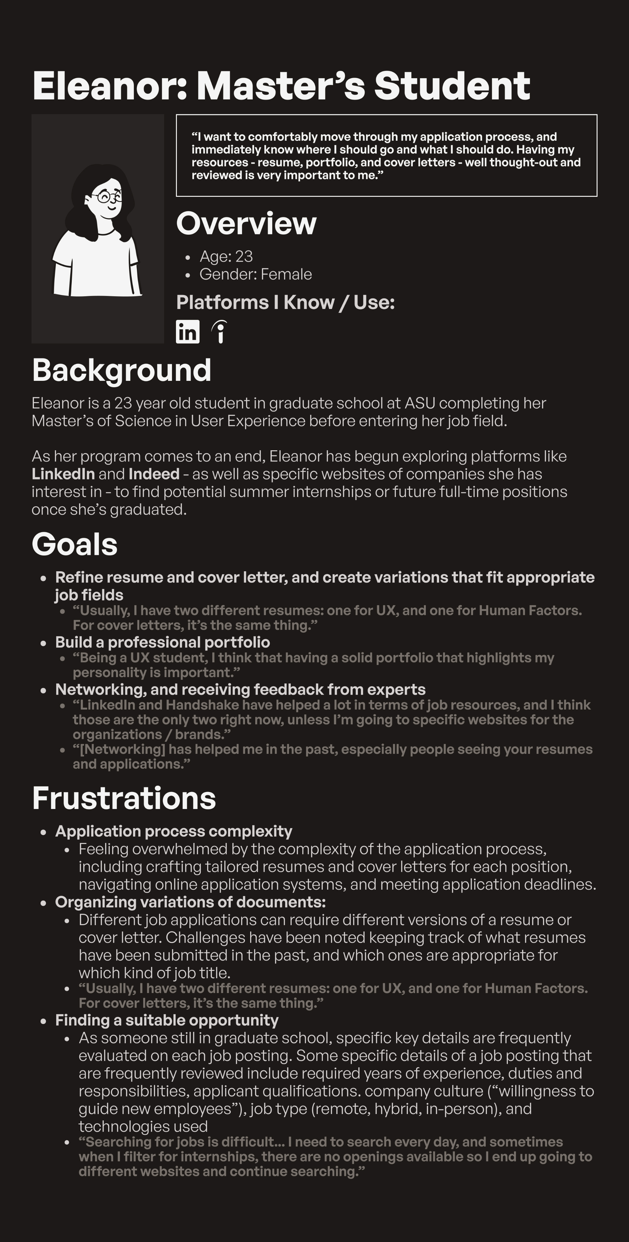
Based on insights gathered during the research phase, I developed a proto-persona named Eleanor, a 23-year-old master’s student at ASU preparing to transition from academia into the UX field. Eleanor represents motivated graduate students who are confident in their abilities but often feel overwhelmed by the complexity of the job application process. Her goals include refining resumes and cover letters for multiple job types, building a strong professional portfolio, and receiving feedback from mentors or peers. Her frustrations—such as organizing document variations, tracking application progress, and finding suitable opportunities—helped shape the core features of the project and grounded the design process in real user challenges.
From Eleanor’s needs and motivations, I developed a series of user stories to guide the design direction and ensure each feature supported user goals. These stories captured specific tasks and desired outcomes, such as: “As a student, I want to easily organize and reuse application materials so I can save time when applying for multiple roles,” and “As a job seeker, I want to track my application history so I can reflect on my progress and identify areas for improvement.” The user stories played a key role in shaping the direction of my ideation process by clarifying what users like Eleanor truly needed from a solution. Each story highlighted recurring themes of organization, visibility, and control—users wanted a way to manage their application materials and track their progress in one unified place. These insights guided me toward the concept of a digital dashboard designed to help users keep track of their job applications alongside the content they create for them, such as resumes, cover letters, and project experience. The goal was to give users the tools necessary to organize and adapt their materials for different roles or fields, reducing the cognitive load and confusion often tied to juggling multiple versions of application documents. This focus became the foundation for the next phase of design, where the structure and functionality of the dashboard began to take form.
Ideation & Design // Initial Wireframes
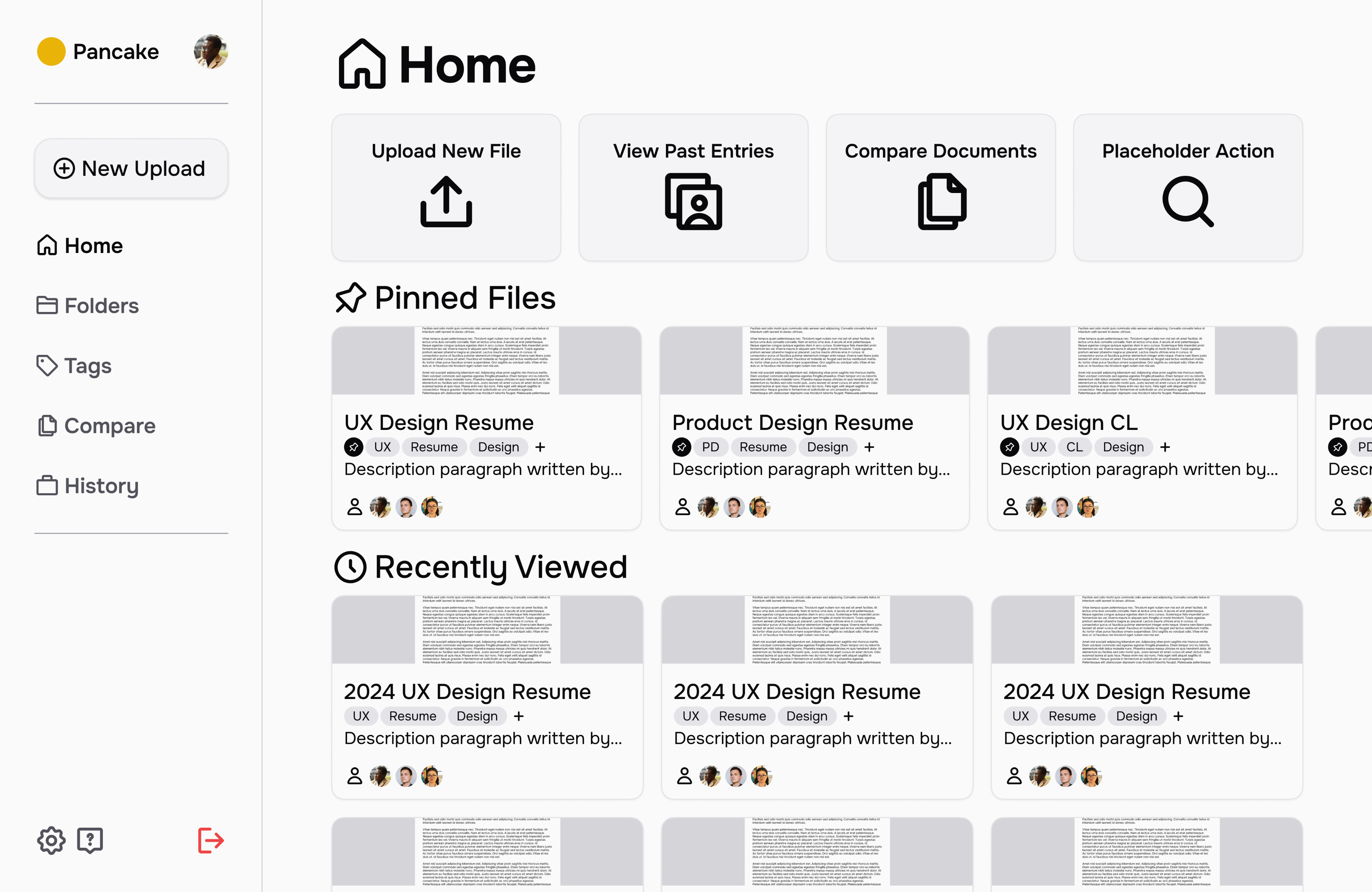
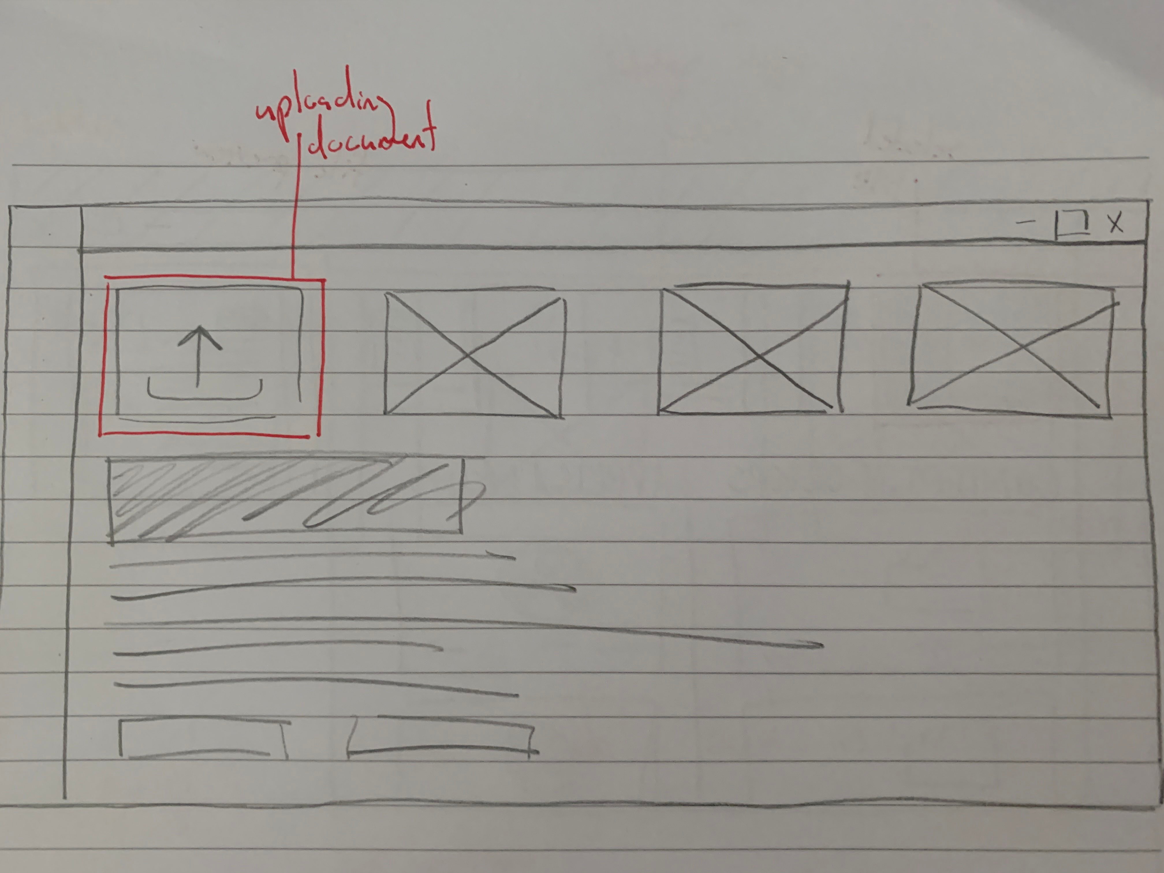
Building on the direction established through my user stories and ideation exercises, I began the design process by sketching initial wireframes on paper to visualize the core layout and functionality of the platform. These early sketches outlined a job application tracking dashboard centered around organization and clarity. The concept focused on allowing users to upload the content they use for applications—such as resumes, cover letters, and project examples—while keeping notes on where each piece had been used. I also incorporated a system of labels and tags to help users categorize their materials by relevance to specific positions, fields, or skill sets. This paper stage helped me quickly explore different structures and interactions, establishing a foundation for how users would manage and navigate their application materials within a single cohesive dashboard.
Final Prototype
In the final stage of the project, I translated my paper concepts into high-fidelity prototypes for my product, which I named Pancake—a reference to the “stack” of content users build throughout their job application journey. The name reflects the layered, iterative nature of the process, where each resume, cover letter, and project contributes to a growing foundation of professional experience. The final prototype brought together all previous insights, emphasizing organization, clarity, and ease of use in managing application materials. I concluded the project by presenting my findings and design outcomes alongside my teammates, Maica and Katelyn, demonstrating how our collective research and individual design directions addressed the challenges uncovered during our user studies. Together, our work showcased a comprehensive approach to understanding and improving the student-to-career transition through thoughtful, user-centered design.
Conclusions
The significance of this project stands true most in my growth as a collaborative worker, listener, and leader, but also through the sheer scale of Classes to Careers. Looking back on the semester as a whole, the project had integration of the UX design process, analysis and reporting on user research (including supporting documents based on data), initial sketches, and final high-fidelity interfaces. This project provided insight on every stage of the design cycle, and allowed us as students to better understand the needs of this cycle as a whole.
Throughout this project, I played a key role in writing, content organization, and ideation, particularly during the collaborative stages focused on the research plan and findings report. Much of my team involvement centered on strategic planning and coordination, ensuring clear task ownership and realistic timelines. As the project transitioned into individual work, I naturally took on both mentorship and collaboration roles—offering feedback and design suggestions to peers while also seeking their input to refine my own ideas. This ongoing exchange of insights strengthened not only the final outcomes but also my ability to communicate effectively, provide constructive critique, and adapt within a multidisciplinary team environment. Working alongside such talented peers was an invaluable experience that deepened my collaborative and leadership skills.
Poetential
What started my case study with Poetential?
For this case study, I collaborated with Cardell Poe, the founder of Poetential, a local Twin Cities business focused on providing healthy alternatives to traditional snacks, such as muffins. After an initial conversation with Cardell to understand his goals and the challenges his business faced, I began a structured research process to uncover insights about his target audience, product positioning, and potential digital presence. Using a combination of qualitative research methodologies, I gathered information on user behaviors, preferences, and perceptions related to healthy snacking and small food businesses. These findings guided the design phase, where I translated insights into strategic design decisions aimed at strengthening Poetential’s brand identity and creating a more engaging experience for its customers.
Who was involved and what was made?
This project was made individually. All work presented for research, ideation, and design was completed on my own.
The Poetential project progressed through several key phases, each building on the last. The initial research phase included a survey with over 25 respondents, a detailed research plan, and user interviews—all emphasizing accessibility to ensure inclusivity from the start. I also conducted an accessibility audit of Poetential’s existing website, assessing visual contrast, navigation, and compliance with accessibility standards. In the usability testing phase, I developed materials, conducted tests, and compiled findings addressing both usability and accessibility. These insights informed wireframing, where I created low-fidelity designs focused on clarity and inclusive interaction. The project concluded with high-fidelity prototypes in Figma, integrating user feedback and maintaining accessibility best practices throughout.
Research // Quantitative Survey & User Personas
Poetential is an online service providing healthy alternatives to common food items. This is a service with various competitors having similar goals for their users, which led to a lot of questions for me to ask regarding interests and issues with Poetential or anything similar. This survey aimed to find primary demographic details for Poetential’s audience, and learn about some of the challenges and opportunities in Poetential’s user journey along with similar websites of other brands. The survey was sent to colleagues who expressed an interest in Poetential or websites with similar goals, and also spread out by the owner of Poetential himself which is where a significant percentage of participants came from. The survey ended with 28 total participants, with 17 participants being familiar with Poetential prior to taking the form. You can find the results for the survey in a full research document here.
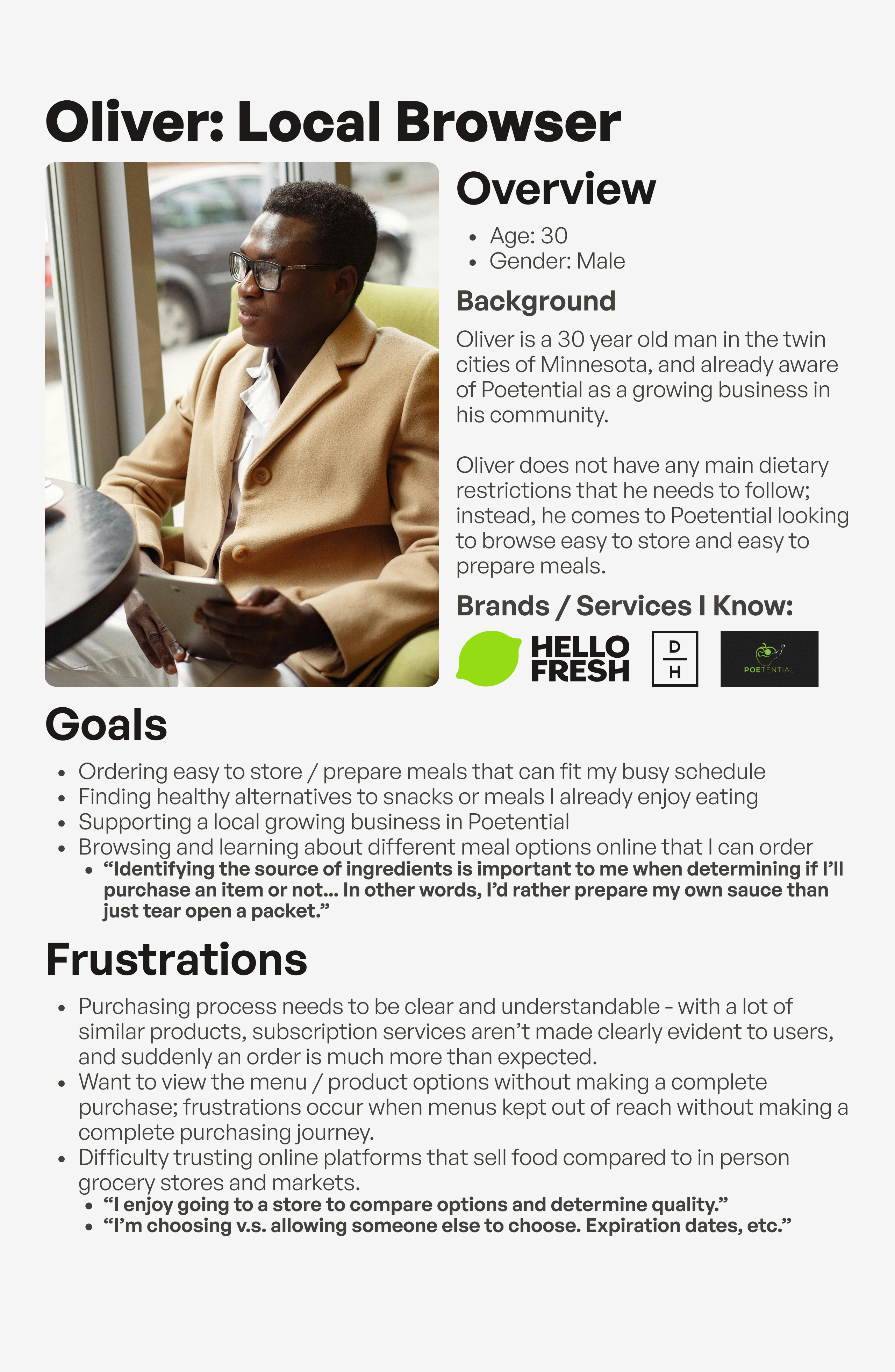
The results were also brought to life with 3 different user personas, each visualizing different groups of demographics and response types found within the user survey.
Research // Accessibility Audit & Heuristic Evaluation
Poetential's current state has many opportunities for improvement in terms of accessibility. This accessibility audit was conducted using the Web Accesssibility Evaluation Tool, which helped in identifying key errors, alerts, and contrast issues within each page of Poetential. Categories, details, and severity levels for each section of the POUR acronym (Perceivable, Operable, Understandable, and Robust) were found using WebAIM's WCAG 2 Checklist. Various issues were found throughout all of Poetential's list of pages established in my heuristic evaluation, with the most common category in the POUR acronym being Perceivable. View the full accessibility audit here.
Research // Usability Testing
Many of Poetential’s current usability issues centered around the visibility and clarity of key product information, including stock status, nutritional details, storage and preparation guidelines, flavor profiles, and dietary classifications. Usability testing confirmed that users struggled to easily locate or interpret this information, which often disrupted the browsing and decision-making process. Participants also reported confusion with site navigation and difficulty reading certain text due to low contrast, highlighting broader accessibility concerns. Based on these findings, I proposed a series of targeted design solutions—such as improving contrast and readability on product and home pages, clearly labeling stock status and nutritional information, and adding storage and preparation details directly within product descriptions. Additional recommendations included visually organizing key ingredients, identifying dietary relevance, and reducing the dominance of green in the color palette to improve visual balance. Together, these refinements aimed to make Poetential’s website more intuitive, informative, and accessible, directly addressing the user pain points uncovered through testing.
View the usability testing materials here, and the usability testing data here.
Design // Initial Wireframes
During the initial wireframing stage for Poetential, I began translating the insights gathered from both the usability tests and the heuristic evaluation into tangible design solutions. These low-fidelity wireframes focused on restructuring product pages to improve information hierarchy and ensure that key details—such as stock status, nutritional information, and storage or preparation instructions—were immediately visible and easy to interpret. I also experimented with clearer navigation patterns, stronger visual contrast, and simplified layouts to address accessibility concerns identified in earlier testing. This stage served as the foundation for refining the site’s usability and setting the groundwork for the high-fidelity prototype.
Design // Final Prototype
For the desktop and mobile redesign prototypes of Poetential, I focused on resolving key usability issues identified during testing, including navigation confusion, missing ingredient details, poor contrast, lack of storage and preparation information, and unclear stock indicators. Usability testing showed that 40% of participants experienced confusion with navigation, 4 out of 5 wanted more ingredient details, all participants struggled to find storage or preparation guidance, and 3 out of 5 had trouble determining product availability. In response, the redesigned prototypes introduced a simplified navigation bar with all main pages visible, removing the collapsible sidebar for easier access. Ingredient and nutritional details were made more discoverable through added buttons on both the home and product pages. Contrast and readability were enhanced across the interface, particularly on the “All Products” page tabs, to clearly show which section is active. Storage and preparation information now appears directly below key product actions, and stock status is communicated through distinct, high- and low-contrast “add to cart” buttons. Together, these updates create a clearer, more accessible, and user-friendly browsing experience.
Conclusions
The Poetential project stands out as the most research-dense case study in my portfolio, representing a full cycle of user-centered design grounded in continuous analysis and iteration. From surveys, interviews, and accessibility audits to usability testing and heuristic evaluations, each stage of research provided new insights that shaped and refined the redesign process. Every phase offered an opportunity to reflect on findings, reassess assumptions, and identify actionable solutions that directly improved the user experience. The result was a thoughtful, accessibility-focused redesign supported by evidence from real users, demonstrating my ability to move between research and design.
Projects
Hello! What you’re about to read is a list of projects I’ve contributed to — either alone, or with a team — in the fields of user experience and digital marketing.
I am, first and foremost, an academic. I was raised this way by friends and family, and thrown even deeper in as I fell in love with the fields I find myself chasing today in this section. I have followed the road of this field to its academic peak with graduate school; in every way I could put into words and actions, user experience is my love and passion. That is the package deal with me. I love this world: every aspect of user experience I have studied, lived, and breathed.
The projects here will go into detail about the context of how each assignment started, what the deliverables were, and what the process was to accomplish the deliverables for each project. This work is not presented as a collection of polished end results, but as evidence of my thinking, my growth, and my commitment to approaching problems with care, curiosity, and rigor. Each project reflects how I ask questions, navigate constraints, and translate research into design decisions grounded in both empathy and strategy.
More than anything, however, I hope the takeaway of these three projects is what you find in this introduction. I love the work I do, and I will love every second of the work I could do for you.
Project Portfolio
Annotate
What started my case study with Annotate?
Annotate began as a passion project inspired by my love for reading and my ongoing search for the perfect reading tracker. Over time, I cycled through several popular platforms — Goodreads, StoryGraph, Fable, Pagebound, Oku.club, and Literal.club — each offering unique features but never quite capturing everything I wanted in a reading experience. Through exploring these apps, I noticed recurring gaps in usability, personalization, and community engagement. Annotate grew out of this reflection, combining what I learned from each platform into a single, cohesive mobile app concept designed to better support readers in tracking, reflecting on, and sharing their reading journeys.
Who was involved and what was made?
This project was made individually. All work presented for research, ideation, and design was completed on my own.
For this case study, I conducted a competitive analysis to examine the features, strengths, and weaknesses of mainstream reading tracker apps, gaining insight into how users currently engage with these platforms. Using these findings, I developed a general information architecture to define the structure and flow of the Annotate app, ensuring an intuitive user experience. From there, I designed high-fidelity wireframes that visualized the app’s interface and interactions, culminating in a fully realized final prototype that showcased the core functionality and visual design of Annotate.
Research // Competitive Analysis
To better understand the current landscape of reading tracker apps, I conducted a competitive analysis focusing on three of the most prominent platforms: Goodreads, StoryGraph, and Fable.
Goodreads stands out for its flexibility and scale—it provides nearly every tool a reader could need, from tracking and reviews to recommendations and community lists. Its massive user base also supports a dynamic browsing and discovery experience. However, the platform struggles with interface consistency and often feels visually crowded, which can hinder overall usability.
StoryGraph, by contrast, excels in personal tracking, offering robust functionality for analyzing reading habits and statistics over time. This analytical strength sets it apart from its competitors, though it lacks the same level of community engagement or social posting features.
Fable, on the other hand, shines in its cohesive interface design and strong promotion of community through book clubs, discussions, and social sharing. Fable became a major reference point in my own design process, especially in shaping Annotate’s information architecture, as I aimed to make posting, sharing, and engaging with fellow readers a core experience of the app.
Through this analysis, I gained a clearer understanding of what readers value most in a tracking app—balance between functionality, clarity, and connection. Goodreads highlighted the importance of scale and discoverability, but also reminded me of the pitfalls of cluttered design. StoryGraph demonstrated the appeal of meaningful data visualization and personal insights, while Fable reinforced the impact of a clean interface and strong community features. Combining these observations, I identified a core opportunity for Annotate: to create a platform that merges StoryGraph’s depth of tracking with Fable’s sense of community, all within a more focused and visually consistent interface.
Goodreads
Storygraph
Fable
Ideation // Information Architecture
Building on the insights from my competitive analysis, I designed Annotate’s information architecture to create a clear, engaging, and intuitive experience for readers. My primary goal was to highlight community interaction as the central feature of the app while keeping personal tracking accessible and easy to navigate. I organized the structure around three main pillars—Track, Share, and Discover—to reflect the core user actions and maintain a logical flow throughout the experience.
While browsing and adding books remain a key part of the app, they were intentionally positioned as a secondary focus to engagement. Certain navigation elements help users seamlessly add books to folders or collections, but the IA ultimately places community-driven activity—such as posting, commenting, and sharing—at the forefront, similar to platforms like Twitter or Threads. This approach ensured that Annotate’s foundation emphasized connection and participation, supporting its goal of making reading a more social and interactive experience.
Ideation // Initial Wireframes
The wireframing process for Annotate began with a simple but foundational sketch drawn on an index card. This first physical wireframe helped me visualize the app’s overall layout, hierarchy, and user priorities before moving into digital design. The sketch depicted a home page centered around user posts—an early expression of Annotate’s focus on engagement and community interaction. At the top, two tabs labeled Friends and Books offered flexible ways for users to filter their feed, allowing them to view posts from people they follow or from books they’re tracking in their folders. This small but intentional design choice reflected my goal of blending social and reading experiences, giving users a personalized feed shaped by both their community and their collection.
As I moved into the high-fidelity prototype stage, my primary goal was to create a seamless and convenient experience between tracking books and engaging socially within the app. I wanted users to feel that managing their reading activity and participating in community discussions were naturally connected—not separate tasks. This meant focusing on smooth navigation, intuitive gestures, and consistent interface patterns that made switching between viewing a book, adding it to a folder, posting a reflection, or commenting on another user’s post effortless. By emphasizing this fluidity, the design aimed to reinforce Annotate’s core identity as both a reading tracker and a social space for readers to share, discover, and connect.
Final Prototype & Conclusions
The final prototype for Annotate brought together all the design goals and insights developed throughout the project. Built in Figma, the prototype includes a comprehensive set of pages and subpages that showcase the app’s full functionality. The Feed page centers on community engagement, allowing users to view and interact with posts from friends or books they follow. The Folders section provides an organized space for tracking reading progress—whether it’s books currently being read, finished, or saved for later. A dedicated Search page enables users to browse and discover new titles, while the Annotations page compiles all user posts and allows filtering by type, such as quotes, questions, discussions, theories, or updates. Rounding out the experience, the Profile page serves as a personal hub for tracking activity and sharing reflections.
In completing Annotate, I focused on integrating the strongest elements from existing reading tracker apps while reimagining how readers connect with one another. From Goodreads, I drew inspiration from its flexibility and vast network of content; from StoryGraph, I carried forward its robust personal tracking and data-driven insights; and from Fable, I adopted its cohesive interface and strong sense of community. However, Annotate pushes this concept further by placing community engagement at the core of the experience rather than treating it as an added feature. Through thoughtful information architecture, intentional navigation, and a design system built around interaction, Annotate presents a new take on reading apps—one that not only tracks what you read, but celebrates the conversations, reflections, and shared experiences that come with it.
Classes to Careers
What started my case study with Classes to Careers?
The goal of this semester-long project was to identify a problem or topic we wanted to investigate further regarding the transition from “class to career” for User Experience students at Arizona State University. Alongside Maica Avila, Katelyn Dang, Poorva Ketkar, Erin Mishark, and Atharva Nikam, we decided to narrow in on the job application process, in hope of identifying key problems in the experience that we can improve in the later half of the semester. After the research is completed as a team, we break apart to create individual solutions for the problems we identified in our two research methodologies.
Despite only one section being completed in full as a team with five other classmates, the entirety of this class was a collaborative effort. A significant percentage of this class—and, adjacently, this project—was spent working on my individually completed tasks alongside my classmates: seeing their process, letting them see my process, and bouncing ideas off one another constantly. I worked with some incredibly talented students during this project, and—with how widespread our assignments were, moving from one section to the next—one major skill I learned was identifying strengths of each classmate.
Who was involved and what was made?
The research phase included 5 teammates from the College of Integrative Sciences and Arts: Maica Avila, Katelyn Dang, Poorva Ketkar, Erin Mishark, and Atharva Nikam.
The Initial Research phase was the only section completed entirely as a group, involving a competitive analysis, a research plan, and two research methodologies: user interviews and think-aloud inquiries. In the Research Findings phase, we collaborated on a comprehensive report, while individual deliverables—such as the proto-persona and user stories—were completed independently. The Ideation phase included an in-class workshop and scenario sketches based on key insights, leading into the Design phase, where these ideas were developed into a cohesive high-fidelity prototype in Figma.
Research // Research Findings
Our team conducted a qualitative study using user interviews and think-aloud inquiries to understand the experiences of ASU students and recent graduates navigating the job search process. By observing participants interact with job platforms and describe their decision-making in real time, we uncovered key challenges in content creation (writing cover letters and tailoring resumes), portfolio development, and job filtering (finding opportunities that align with skills, goals, and sponsorship needs). Participants also emphasized the importance of company culture, mentorship, and accessible guidance throughout their search. These findings revealed a gap in how students manage and reflect on their job applications, inspiring our next phase of ideation to focus on solutions that simplify tracking, enhance confidence, and better connect students with relevant opportunities and support.
Research & Ideation // Proto-Persona and User Stories
Based on insights gathered during the research phase, I developed a proto-persona named Eleanor, a 23-year-old master’s student at ASU preparing to transition from academia into the UX field. Eleanor represents motivated graduate students who are confident in their abilities but often feel overwhelmed by the complexity of the job application process. Her goals include refining resumes and cover letters for multiple job types, building a strong professional portfolio, and receiving feedback from mentors or peers. Her frustrations—such as organizing document variations, tracking application progress, and finding suitable opportunities—helped shape the core features of the project and grounded the design process in real user challenges.
From Eleanor’s needs and motivations, I developed a series of user stories to guide the design direction and ensure each feature supported user goals. These stories captured specific tasks and desired outcomes, such as: “As a student, I want to easily organize and reuse application materials so I can save time when applying for multiple roles,” and “As a job seeker, I want to track my application history so I can reflect on my progress and identify areas for improvement.” The user stories played a key role in shaping the direction of my ideation process by clarifying what users like Eleanor truly needed from a solution. Each story highlighted recurring themes of organization, visibility, and control—users wanted a way to manage their application materials and track their progress in one unified place. These insights guided me toward the concept of a digital dashboard designed to help users keep track of their job applications alongside the content they create for them, such as resumes, cover letters, and project experience. The goal was to give users the tools necessary to organize and adapt their materials for different roles or fields, reducing the cognitive load and confusion often tied to juggling multiple versions of application documents. This focus became the foundation for the next phase of design, where the structure and functionality of the dashboard began to take form.
Ideation & Design // Initial Wireframes
Building on the direction established through my user stories and ideation exercises, I began the design process by sketching initial wireframes on paper to visualize the core layout and functionality of the platform. These early sketches outlined a job application tracking dashboard centered around organization and clarity. The concept focused on allowing users to upload the content they use for applications—such as resumes, cover letters, and project examples—while keeping notes on where each piece had been used. I also incorporated a system of labels and tags to help users categorize their materials by relevance to specific positions, fields, or skill sets. This paper stage helped me quickly explore different structures and interactions, establishing a foundation for how users would manage and navigate their application materials within a single cohesive dashboard.
Final Prototype
In the final stage of the project, I translated my paper concepts into high-fidelity prototypes for my product, which I named Pancake—a reference to the “stack” of content users build throughout their job application journey. The name reflects the layered, iterative nature of the process, where each resume, cover letter, and project contributes to a growing foundation of professional experience. The final prototype brought together all previous insights, emphasizing organization, clarity, and ease of use in managing application materials. I concluded the project by presenting my findings and design outcomes alongside my teammates, Maica and Katelyn, demonstrating how our collective research and individual design directions addressed the challenges uncovered during our user studies. Together, our work showcased a comprehensive approach to understanding and improving the student-to-career transition through thoughtful, user-centered design.
Conclusions
The significance of this project stands true most in my growth as a collaborative worker, listener, and leader, but also through the sheer scale of Classes to Careers. Looking back on the semester as a whole, the project had integration of the UX design process, analysis and reporting on user research (including supporting documents based on data), initial sketches, and final high-fidelity interfaces. This project provided insight on every stage of the design cycle, and allowed us as students to better understand the needs of this cycle as a whole.
Throughout this project, I played a key role in writing, content organization, and ideation, particularly during the collaborative stages focused on the research plan and findings report. Much of my team involvement centered on strategic planning and coordination, ensuring clear task ownership and realistic timelines. As the project transitioned into individual work, I naturally took on both mentorship and collaboration roles—offering feedback and design suggestions to peers while also seeking their input to refine my own ideas. This ongoing exchange of insights strengthened not only the final outcomes but also my ability to communicate effectively, provide constructive critique, and adapt within a multidisciplinary team environment. Working alongside such talented peers was an invaluable experience that deepened my collaborative and leadership skills.
Poetential
What started my case study with Poetential?
For this case study, I collaborated with Cardell Poe, the founder of Poetential, a local Twin Cities business focused on providing healthy alternatives to traditional snacks, such as muffins. After an initial conversation with Cardell to understand his goals and the challenges his business faced, I began a structured research process to uncover insights about his target audience, product positioning, and potential digital presence. Using a combination of qualitative research methodologies, I gathered information on user behaviors, preferences, and perceptions related to healthy snacking and small food businesses. These findings guided the design phase, where I translated insights into strategic design decisions aimed at strengthening Poetential’s brand identity and creating a more engaging experience for its customers.
Who was involved and what was made?
This project was made individually. All work presented for research, ideation, and design was completed on my own.
The Poetential project progressed through several key phases, each building on the last. The initial research phase included a survey with over 25 respondents, a detailed research plan, and user interviews—all emphasizing accessibility to ensure inclusivity from the start. I also conducted an accessibility audit of Poetential’s existing website, assessing visual contrast, navigation, and compliance with accessibility standards. In the usability testing phase, I developed materials, conducted tests, and compiled findings addressing both usability and accessibility. These insights informed wireframing, where I created low-fidelity designs focused on clarity and inclusive interaction. The project concluded with high-fidelity prototypes in Figma, integrating user feedback and maintaining accessibility best practices throughout.
Research // Quantitative Survey & User Personas
Poetential is an online service providing healthy alternatives to common food items. This is a service with various competitors having similar goals for their users, which led to a lot of questions for me to ask regarding interests and issues with Poetential or anything similar. This survey aimed to find primary demographic details for Poetential’s audience, and learn about some of the challenges and opportunities in Poetential’s user journey along with similar websites of other brands. The survey was sent to colleagues who expressed an interest in Poetential or websites with similar goals, and also spread out by the owner of Poetential himself which is where a significant percentage of participants came from. The survey ended with 28 total participants, with 17 participants being familiar with Poetential prior to taking the form. You can find the results for the survey in a full research document here.
The results were also brought to life with 3 different user personas, each visualizing different groups of demographics and response types found within the user survey.
Research // Accessibility Audit & Heuristic Evaluation
Poetential's current state has many opportunities for improvement in terms of accessibility. This accessibility audit was conducted using the Web Accesssibility Evaluation Tool, which helped in identifying key errors, alerts, and contrast issues within each page of Poetential. Categories, details, and severity levels for each section of the POUR acronym (Perceivable, Operable, Understandable, and Robust) were found using WebAIM's WCAG 2 Checklist. Various issues were found throughout all of Poetential's list of pages established in my heuristic evaluation, with the most common category in the POUR acronym being Perceivable. View the full accessibility audit here.
Research // Usability Testing
Many of Poetential’s current usability issues centered around the visibility and clarity of key product information, including stock status, nutritional details, storage and preparation guidelines, flavor profiles, and dietary classifications. Usability testing confirmed that users struggled to easily locate or interpret this information, which often disrupted the browsing and decision-making process. Participants also reported confusion with site navigation and difficulty reading certain text due to low contrast, highlighting broader accessibility concerns. Based on these findings, I proposed a series of targeted design solutions—such as improving contrast and readability on product and home pages, clearly labeling stock status and nutritional information, and adding storage and preparation details directly within product descriptions. Additional recommendations included visually organizing key ingredients, identifying dietary relevance, and reducing the dominance of green in the color palette to improve visual balance. Together, these refinements aimed to make Poetential’s website more intuitive, informative, and accessible, directly addressing the user pain points uncovered through testing.
View the usability testing materials here, and the usability testing data here.
Design // Initial Wireframes
During the initial wireframing stage for Poetential, I began translating the insights gathered from both the usability tests and the heuristic evaluation into tangible design solutions. These low-fidelity wireframes focused on restructuring product pages to improve information hierarchy and ensure that key details—such as stock status, nutritional information, and storage or preparation instructions—were immediately visible and easy to interpret. I also experimented with clearer navigation patterns, stronger visual contrast, and simplified layouts to address accessibility concerns identified in earlier testing. This stage served as the foundation for refining the site’s usability and setting the groundwork for the high-fidelity prototype.
Design // Final Prototype
For the desktop and mobile redesign prototypes of Poetential, I focused on resolving key usability issues identified during testing, including navigation confusion, missing ingredient details, poor contrast, lack of storage and preparation information, and unclear stock indicators. Usability testing showed that 40% of participants experienced confusion with navigation, 4 out of 5 wanted more ingredient details, all participants struggled to find storage or preparation guidance, and 3 out of 5 had trouble determining product availability. In response, the redesigned prototypes introduced a simplified navigation bar with all main pages visible, removing the collapsible sidebar for easier access. Ingredient and nutritional details were made more discoverable through added buttons on both the home and product pages. Contrast and readability were enhanced across the interface, particularly on the “All Products” page tabs, to clearly show which section is active. Storage and preparation information now appears directly below key product actions, and stock status is communicated through distinct, high- and low-contrast “add to cart” buttons. Together, these updates create a clearer, more accessible, and user-friendly browsing experience.
Conclusions
The Poetential project stands out as the most research-dense case study in my portfolio, representing a full cycle of user-centered design grounded in continuous analysis and iteration. From surveys, interviews, and accessibility audits to usability testing and heuristic evaluations, each stage of research provided new insights that shaped and refined the redesign process. Every phase offered an opportunity to reflect on findings, reassess assumptions, and identify actionable solutions that directly improved the user experience. The result was a thoughtful, accessibility-focused redesign supported by evidence from real users, demonstrating my ability to move between research and design.